At Making Sense, our focus is on the user. We design and build all of our software, websites and apps with the user in mind – the user’s convenience, his enjoyment, his success… User Experience is the key! Our Lander product’s new website is no exception.
Delivering a consistent UX across all devices
Lander’s new website was designed to provide visitors with a different experience than before. The new site is more attractive, interactive, easy to navigate, and enables visitors to find what they need in a snap!
As Google Analytics was revealing that more and more users were accessing Lander’s website via smartphones, the decision was made to deliver a consistent user experience across all devices so Lander’s potential customers could find the right information on any screen. Lander Marketing and Support team also conducted extensive customer research using both forms and surveys. The new Lander website improvement project was a true team effort. All of our departments – Marketing, UX Design, Support, Development, etc. – worked together relentlessly to launch the new site.
The feedback from this gave our product, Lander, an opportunity to refine its messaging in line with what users indicated they needed. Landing Pages do tend to be fairly complicated for new users, so the challenge was to deliver the optimum level of detail across all devices without initially overwhelming visitors with too much information.
Finding the right information on any screen size
Lander design team focused on delivering a new website that serves all devices, and that includes computers, tablets and mobile. The information was reorganized, and divided into sections. Some of the new information included on Lander’s amazing templates, added some awesome user testimonials and redesigned the pricing page.

Lander new site also includes a live version of different templates divided in categories so users can create a Lander account right from there. All the new information added to the website was carefully planned to guide the user through the site, prioritizing a content strategy based on how our Lander users actually interacted with the new site.
Making UX a priority with Storytelling
Our team at Making Sense understands that storytelling and User Experience have many common elements such as research, content creation, planning, creating scenarios, etc. When designing a new website it is important to to have a personal touch where users can find an emotional connection that makes them care. Most of the time using storytelling invites the audience to connect people, not computers. For this reason our professionals and designers used storytelling to build human connections on Lander’s new website.
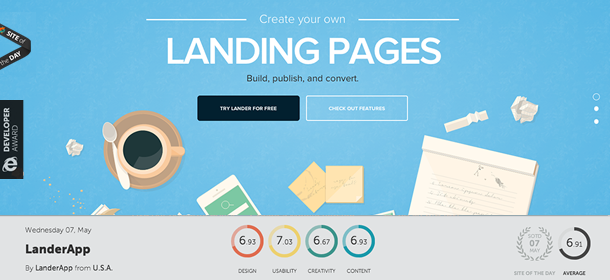
Lander’s new home shows a planning scene which includes a coffee mug, pen, post -it notes, a phone, highlighters and scrap paper. The scene is intended to make the users associate this scenario with what they feel with their own life experience. For example, if the users are planning to start a business, they will easily relate to this scene.
The second scene shows a growing business such as a start-up and includes a traveling bag, markers, and a computer. Finally, the third scene shows the success of a business once they have all their Landing Pages live and their online marketing campaigns are consistent and bringing in revenue and profits.
Enhancing experiences with animations
We used different techniques to achieve the best performance possible and a great, fluid interaction of the whole look & feel.
One of the main aspects we considered -and applied- is replacing plain .png files with svg images. In short, SVG (Scalable Vector Graphics) are vectors in an XML format that can be interpreted as images by all modern browsers (IE9+). Svg’s maintains great looks without breaking/losing quality while resizing on-the-fly. Besides that, the file sizes are very small compared to 32bits pngs.

The other aspect that results in a great performance not only in desktops but on mobile devices as well is animating the environment using just CSS animations and transitions. In the past, these kind of animations were achieved using Javascript; sadly, on mobile devices Javascript does not force GPU renderization, so the animations weren’t fluid and looked pretty choppy at times. By the contrary, CSS animations/transitions trigger GPU renderization resulting in a more fluid and interactive experience.
Last, but not least, we used Javascript to toggle different CSS classes. These classes are the ones that include the animations, transitions and proper delays.
Lander Wins Site of the Day and Developer Awards!
Lander has recently won “The Site of the Day” and “Developer Award” for their new useful, innovative, and Responsive Website development project. The site’s excellent UX and code quality was recognized by Awwwards, an entity that recognizes the talent and effort of the best web designers, developers, and agencies around the world.

When discussing the nomination of Lander’s site design, Awwwards jury remarked that Lander leveraged an excellent execution, with great markups, organized JS and has good indentation. One of the differentiating factors was all of the subtle animations as well as the cross platform/browser experience.
“Thanks for all the kind words about our site. I am proud of our team of designers and the great work we’re doing. We are always doing research and checking out what’s out there in the world of cutting edge design & programming,” Santiago Tribiani, UX Designer for Lander explains.
As a result of winning the award, Awwwards featured Lander’s new website in the Award of the day Section in the Awwwards website on Tuesday, May 7, 2014. Lander will also be part of the nomination for “Site of the Month” and “Site of the Year” and will appear on the book “The best 365 websites around the world 2014,” which is a compilation of the 365 best websites in the world. Last year, Lander also won the 2013 Sadosky Award in the category of Best Information Entrepreneurship Product.
With fantastic User Experience to offer, like our Lander new website, Making Sense has a large number of clients enjoying exciting success stories. Could you be next? Could your company be featured in our next big success story? If you have an idea for a stellar new app or innovative software program, tell us about it. Leverage our expertise and proven software development experience. Contact us today at hello@makingsense.com!
