Get the Meetup Started
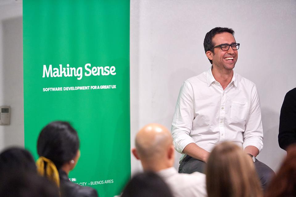
The meetup started with our CEO introducing the panel and the topic. He framed the discussion by illustrating the story behind the Making Sense name. Designers, working with software developers, have to ensure that products make sense.
Twenty years ago, the idea that UX designers have a role in product strategy was more of a novel idea. Over the years, however, design and development have become more integrated as UX has moved to a more central position within the development process.
But how did that happen? We asked our panel how UX got to a point where it’s a major influence on strategy. The discussion branched out from there. Here are the highlights.
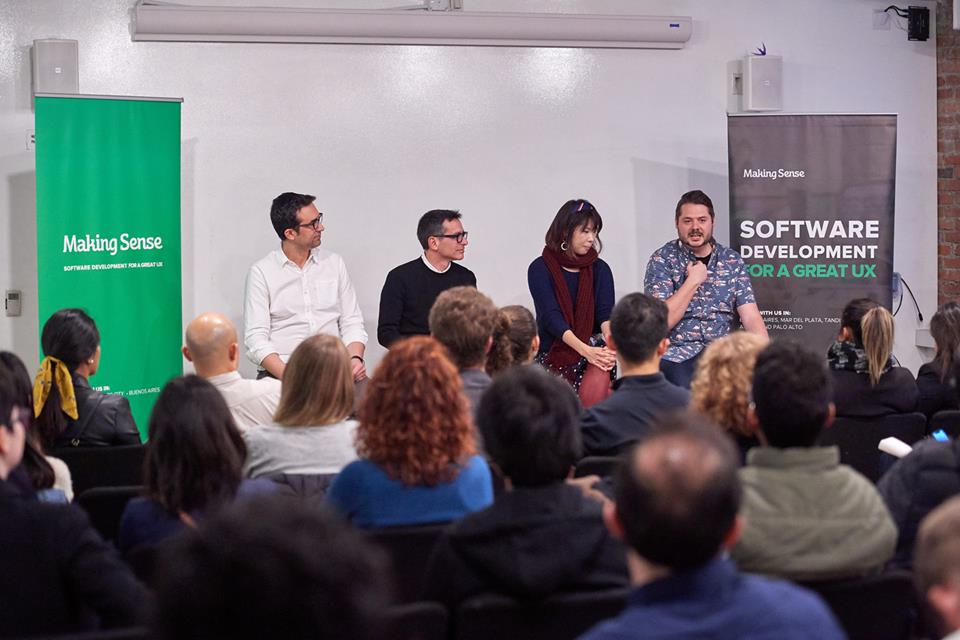
Our Panel of Experts
Elina Lin is currently working as a Product Designer at LinkedIn. She designs to help create more economic opportunities for professionals around the globe. Elina had worked on both consumer and enterprise teams like Simple Habit, Amplitude, and various startups & Fortune 500 companies.
Mariano Garcia has more than 15 years of practical experience in ideation, implementation and improvement of digital products. He’s currently working at Evernote as a UX Designer focused on Search and Intelligent Experiences. Previous experience includes VMware, being the UX Design Lead at Globality and starting his own design firm, The UX Department.
Ryan Oswald is UX Designer at Apple and has more than 12 years of experience in the Design field, from leading UX team to Co-founding his own UX agency. Past experiences include working at Facebook and Google as a UX Designer.
Phillip Bensaid is Founder at DONECOMPANY and worked as a consultant for Aardvark, Lala, Directly, and Flipboard. Executive leader at ASKfm. Steeped in learning at Yahoo! and Frog Design.
How is UX Design connected to the overall strategy of creating a product?
Mariano pointed out that UX wasn’t even called UX when he first started!
Phillip gave insight into the history of design and its relationship to product development. He explained that in the “olden days of the internet” (focusing on digital products), you had smart people with spreadsheets, working to understanding the opportunities in the marketplace. They would essentially create plans which would get put into motion. These plans started out with the higher-ups in the process, then fell down the waterfall until the product finally got to the designer, very close to the end.
He described the process as “Putting lipstick on a pig”. The designer was the recipient of a lot of strategic decisions that had been made without their being involved. He concluded by saying that when you’re the recipient of a directive only at the very end, it’s extremely frustrating.
Fast-forward 30-35 years and that’s changed quite a bit. He explained that designers have been evolving because of the key attributes of their craft and the things that draw them together, the things that make us choose this discipline: curiosity and problem-solving.
“Designers are like Salmon. We’ve been swimming upstream for a long time”.
Philipp Bensaid, Founder at DONECOMPANY
How do various companies make sure that UX is a priority?
Based on his current experience at Apple as well as other companies like Oculus and Google, Ryan Oswald explained that for a long time, User Research was considered very technical with a lot of data-gathering. It was separate from UX and UI. The problem was that CEOs and managers didn’t care about what designers did back then. And likewise, designers didn’t care what the managers did, either. When he was working at different companies, he would be the only UX/UI person and he would have to make them all care about how a product looks. And they didn’t care at all.
The only thing they’re interested in, he went on to say, was what they were working on at the moment.
If you go into detail, like “oh, if you make it look better, people will use it more”, they’ll be like “oh yeah sure, perfect…”
He advised that you have to talk to people in their field. If they’re researchers, you have to talk to them like researchers. If they’re marketers, you have to speak their language. For example: “Oh we could have this in 25 different languages, so go market that” and they’ll get it.
“The key is to relate UX back to what they’re working on.”
You have to know how to influence other departments and Ryan explained that this was really hard at first. He didn’t move up the food chain until he realized that meetings were the most important part. Meetings are where you make people care about what you’re doing, and also how you get more projects.
Elina chimed in that designers can be siloed within the company they work for: “Everyone in the company can be so focused on their job, their task, their goals. They’re not necessarily in tune with the user or the researcher or what the designer is doing…”
…which, by the way, is trying to solve user problems. So, what the designer can do is invite the entire team to come back and start solving for the user.
She continued, saying that this is a problem for bigger and smaller companies alike. People just don’t know that there’s this metric they need to pay attention to. There are so many ways to do this. She added that there are so many tools in the designer’s bag of tricks that they can pull out.
Continuing the salmon comparison, she added that it’s a never-ending swim upstream because everyone’s at their own job.
“We’re kind of like Superheroes for the user. We’re there to tell the story of the user, to make this problem more human.”
Mariano added his insight, too, saying that sometimes designers, especially young designers, get carried away, with “design for design’s sake”. One of the best tools to convince leadership is data. In addition, his company might use video to show a client the various problems users might have, such as someone who’s trying to make an online purchase, but they cannot check out. The client might say “oh yes, this is the problem, go fix it”.
“The most important tool to convince leadership is real data”.
Mariano Garcia, UX Designer at Evernote
On the importance of data, Phillip said that, without data, you’re using intuition and best judgment. He described that as being extremely paralyzing, which got laughs from the audience.
The Importance of the Designer-Developer Relationship
Ryan added a few words about the importance of working with developers. You really have to know your stuff, know what your developers are capable of so you have respect from the developers. Otherwise, they’ll think you’re just an artist.
Elina added that developers often have really great design ideas. Their input allows the product to be so much more elegant so designers need to bring them along in the process.
Phillip said that developers do end up feeling as critical of the product as the designers. It happens during testing when they are busy testing every feature. In this way, they are extremely close to that end user experience.
The Why of UX Matters When Talking to Developers/Leaders
Ryan told an interesting story of when he worked with a team where he was the only UX/UI with 40-50 developers, all in India.
They were like, “Alright Ryan, make everything look pretty. Here you go!”.
How? he’d ask himself. He was given no restraints, no clue what they wanted. They didn’t know what they wanted, at that point. He added that you also have to pay attention to material design (font, colors, the look you use). He’d be given a directive, “Alright, make it look like ours.”. That’s it. Over a period of time, they had so many cooks in the kitchen but nobody was connected with anyone else and nobody knew what was going on. He would go back to the higher-ups and tell them there needed to be more collaboration.
Their response would be, Why? Why would we do that?
This is why: the end user needs to be locked in from the beginning. Everyone has to know why they’re doing this and that. Ryan used a great analogy. If you tell a newborn that the way to use Facebook it to just go ahead and post a picture of yourself, they’d answer, why would I do that? You have to explain why.
How Do You Keep Everyone Engaged?
Phillip told the audience about his last company, where he was responsible for taking a product and reinventing it, finding a way to make it relevant, and creating a road map into the future. They came up with a quarterly road map.
Every quarter they’d have a vision. It’s important, he explained, because the quarterly method is helpful for creating a product “North Star” to guide you. A simple example to illustrate: “Make people 2% happier”. Every product decision has to apply to that directive. You’re creating an environment of overarching storytelling, structuring the entire team around that initiative.
Elina summed it up by saying that it all comes down to whether we are creating solutions. The key is to understand what a user really needs, then think about what is the value of what you’re creating.
What do you say to a designer … if they’re not very good at strategy, how do you correct their approach?
Ryan joked that he used to be that person. He then went on to stress the importance of using data to back up your ideas and being able to strategize, not just design. The reason?
“In this day and age, I guarantee you that there will be 4 or 5 companies all trying to do the same thing as you.”
But sometimes it’s the leaders in your own organization who need convincing. Ryan gave the perfect example. There was an issue, and he kept harping on his idea for solving it. This went on for months. One manager finally told him, “All I need is another reason to do it. When you come up with a new idea, there’s usually no research to back it up. Nothing to prove whether it works or not.”
What About Designers and the Bottom line?
Extending the idea of strategizing, Ryan went on to say that the bottom line for most companies is really strict, especially if they’re large. And if you don’t align to that, you’ve got problems. Basically, when you come in as a designer, you have to know what the budget is.
What About International Design Sensibilities?
Ryan pointed out that the best way to learn how another country does design is to play their video games. If you go to Russian Facebook, it still looks like Facebook, right? No learning. If you go to a foreign video game, you really learn, expanding your international knowledge of design.
Elina added an example from her job at LinkedIn. They use symbols for Yes and No. But people see these symbols differently. For example, a check is actually “wrong” in some places so people were misinterpreting answers as wrong when they were actually correct. LinkedIn should have been using a circle instead. Also, certain languages go from right to left, so that creates layout problems.
What About Startup vs Big Companies?
Mariano started by saying the more diverse the team, the more ideas are going to come to the table. He then posed the question: So, how would you compare running a UX project at a startup vs working at a big company?
Ryan told a story of how his startup lost funding because overnight the client scared away all their capital because of patent issues. He had to fire everyone in his company. He pointed out that in a startup, you have so much power, you really have to listen to other people because you get really full of yourself really fast.
“In a startup, you have so much power, you really have to listen to other people because you get really full of yourself really fast”.
Ryan Oswald, UX Designer at Apple
Ryan went on to say that when you’re working in a large company, on the other hand, you are going to run into a lot of egos — people who’ve been in the business for 15 years. And if it doesn’t sound like it’s their idea, they’re just going to say no. What they’re actually doing is waiting for you to forget about it and then they’ll bring it up as their own idea. Happens all the time.
“When you work at a startup, the design isn’t going to be as important as making the product work. That’s just bottom dollar. If it’s ugly, they just won’t use it.”
But seriously, he went on to say, make sure it works first and make sure your developers are happy.
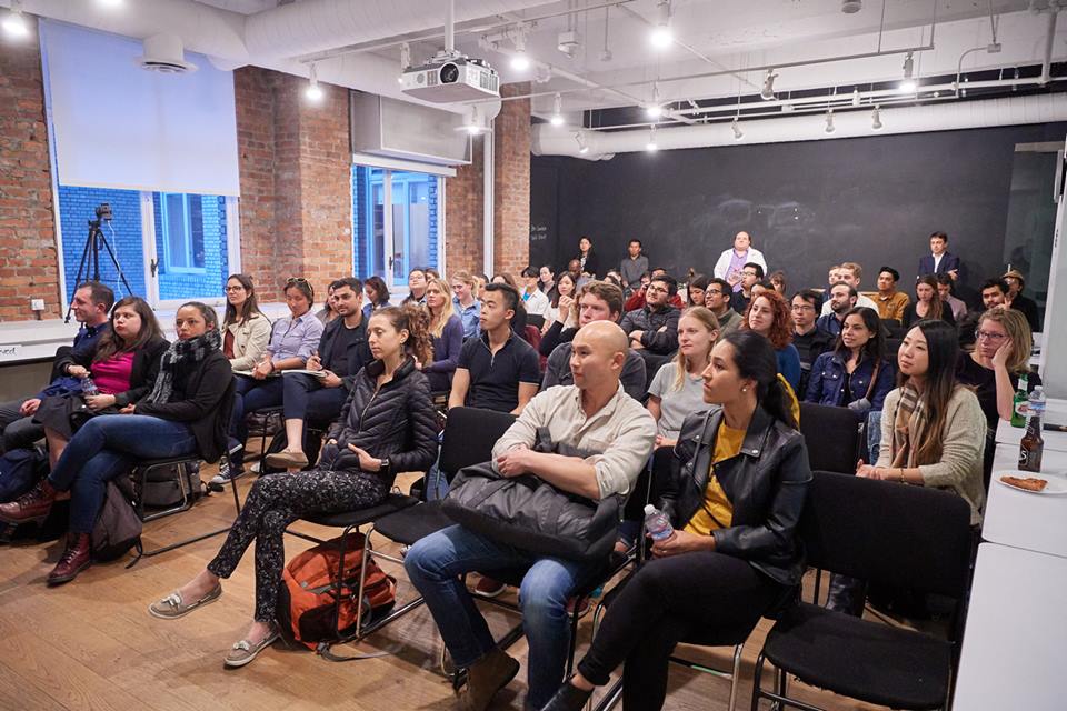
As the meetup started to wind down, the panel went into a few more areas and took questions from the audience. One topic was, How do You Deal With Failure? Key insights from the panel included:
- In the USA, it’s more “Okay” to fail, whereas in other countries it’s more of a game-stopper.
- Don’t get too married to a particular idea. Just move on.
As the meetup ended, there were lots more questions and great answers from our panel of four UX designers who had so much to share with us. We’re grateful to have had such a great group, a great audience, and a great time. We can’t wait to do this again!
Here’s the video of our meetup. Take a look at it!
See our photo album, you might appear in one pic :)


