Lander App is an online tool that helps companies create beautiful high-conversion landing pages in just seconds and without help from developers and designers. The platform was created by Making Sense in 2012 and in 2016 it was acquired by a Silicon Valley-based company, Internet Cowboy Ventures.
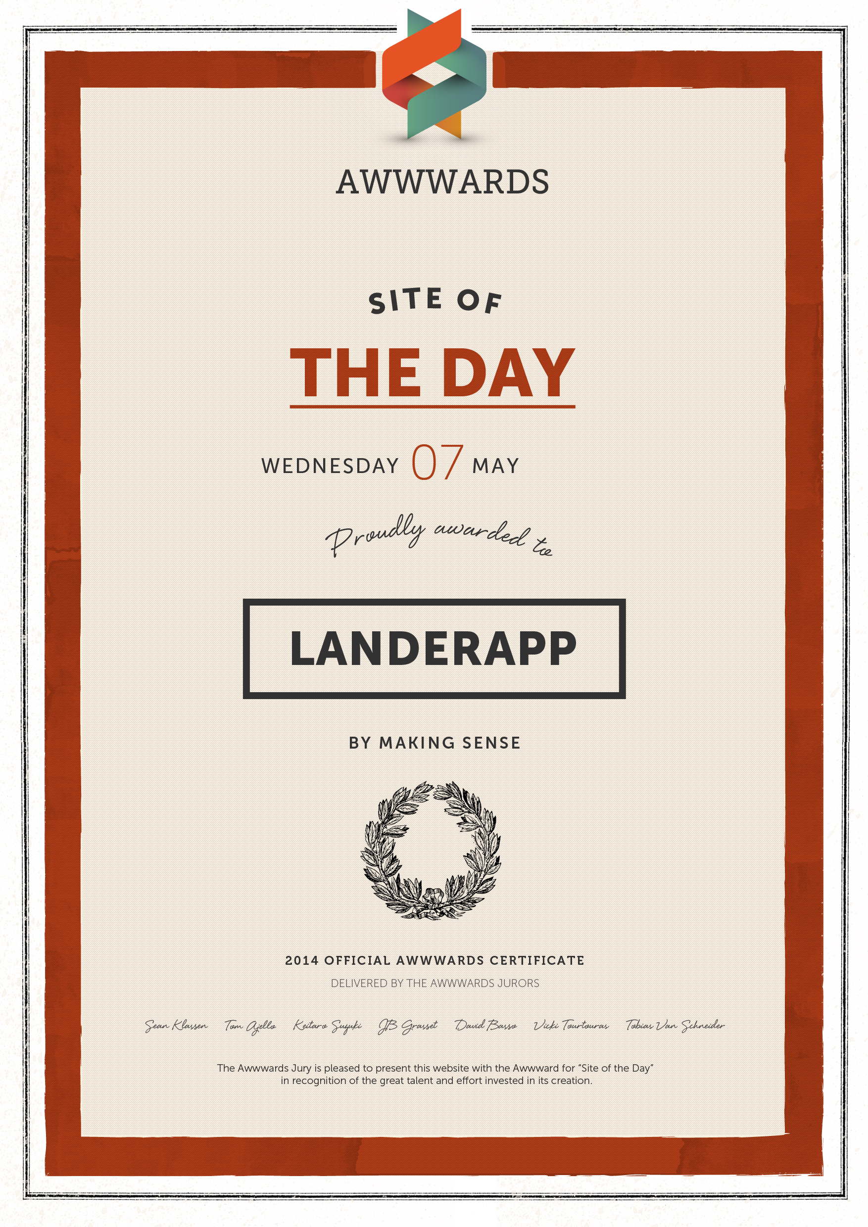
The power of Storytelling was central in Lander’s relaunch and thanks to that, it was awarded the prize of “Best Web Site of the Day” and “Best Website Development” by the U.S. Entity Awwwards, highlighting its excellent user experience, content, and design.
The Lander Website relaunch occurred in 2014 when the platform was still under the management of Making Sense. At that time, the product had been live and successful for two years. Following the natural course of business and technology, the platform and the opportunity began to evolve. There were new plans that began to emerge, such as free trials and freemium models. Lander had new features to offer and there was an opportunity to update the website and communicate its new direction and progress.
The main objectives for the project were:
- Create a more attractive and interactive website
- Improve content architecture, make it easier to scan, read and navigate
- Increase conversions and improve SEO
- Clarify sections (Pricing, Features, Templates) and Lander’s value proposition
- Make the website responsive
We built the team from a pool of digital marketing industry experts who were familiar with the standard metrics and who would clearly see an opportunity to improve Lander’s conversion rates. After a heuristic evaluation of the current website, we identified which elements worked and which could use some improvement. The websites of competitors Unbounce and Instapage were used as benchmarks for the project.
First, we focused our attention on developing a new website architecture. We interviewed our users and had internal meetings with the main stakeholders, product owner, sales, marketing and development teams. User flows were created and, based on them, a Sitemap was developed. After testing the Sitemap with our users and teams, we designed and validated a set of low and then high fidelity Wireframes.
To design the website, we used The 5-Second Rule, described as the ability of the website to deliver three pieces of critical information in 5 seconds or less:
- Who are you?
- What product or service do you provide?
- Why should I care (What’s in it for me)?
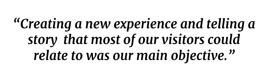
Right away, we noticed we had a communication problem. Visitors couldn’t easily understand what Lander was about so we began to explore different ways of explaining the product. We realized that creating a story was the best alternative. A Hero Image was used to explain that Lander was for small businesses and startups. “The product could help reach your business objectives, increasing conversion rates, and online sales.”
The Ideation of the Storytelling
- What? Show Lander’s benefits through a story
- How? Throughout the Idea: Grow your business
- How did we solve it? Showing the evolution of an office becoming more professional as a result of using Lander.
Our first idea was to create a video that would show how a business could grow with Lander. However, we encountered problems with the servers and the conversion rates were low. At that time, browsers had limitations on videos and animations. We discarded the video alternative. How could we tell the story with something like a video, but without using one? How do we simulate a video in the code? By using elements in the interface?
After exploring the matter, we discovered the SVG animations technique which at that time overrode browser rules and limitations. Scalable Vector Graphics (SVG) is an XML-based vector image format for two-dimensional graphics with support for interactivity and animation. This led to the creation of a new type of website design that, until then, wasn’t being used in the industry. Through innovation, the obstacles (browser limitations) were surpassed!
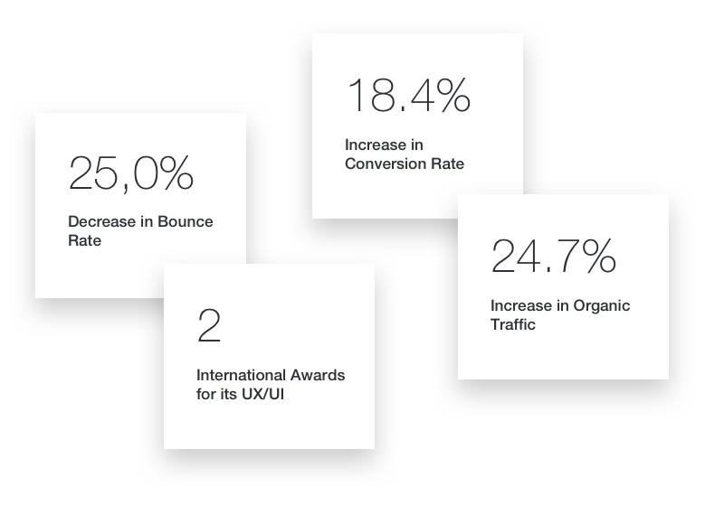
This breakthrough allowed us to tell a story through an animated interface. The story was illustrated, then replicated on the slider. Then, the site was finally ready for production. Through A/B Testing we iterated the site until we reached outstanding metrics. With this technique, and through powerful storytelling, we were proud of the results:
Metrics aside, however, the team was proud to have achieved something that not all developers and designers get to experience very often in a lifetime. The aesthetics and the techniques we used on this relaunch project were new. Nobody else was using them at that time — not even industry leaders. Even the big brands, the highly recognizable sites, weren’t doing what we did in order to tell a story online.
Realizing this, I knew we had an outstanding team. And that’s what we bring to the table for all our clients — teams that create a compelling story, teams that employ innovation and that break borders to create a unique user experience. It’s what we do for every project at Making Sense!