What happens to your bottom line when customers repeatedly abandon the checkout process because it doesn’t flow smoothly from one step to the next?
What’s the cost of each frustrated user who gives up during your sign-up process due to a bulky, complex form?
It’s important to understand both the importance of good User Experience (UX) and the costs of bad UX. Bad UX typically means that your online presence—your website, your application, your platform— is causing you to lose users and/or opportunities, and/or money. And we all know that when you lose users, you lose money!
To demonstrate, here are some of the scary side effects of bad UX
1. Friction/Cognitive Load
Friction or cognitive load is, in short, everything that causes a user to have problems, doubts, frustrations, etc. while using your product or service.
The greater the difficulty for a user to perform a task, the greater the cognitive load.
Remember that each person has a limit to their cognitive load and that this limit will depend on emotional factors, more than anything.
Let’s think about it in a simple way. Suppose, after a busy day at the office, you’re involved in a small fender bender. You arrive home in an understandably bad mood and immediately start surfing the internet to buy the parts you need to fix your car. When you’re finally ready to make the purchase, you see that you have to fill out a complex form and above all, the performance of the site is very bad. Clearly, on that day, you would have a low limit of acceptable cognitive load or in other words, little patience. It’s safe to say that when you come across that form, there’s a pretty good chance you’ll find somewhere else to shop.
Certainly, a user experience professional can help to reduce friction to a minimum in this scenario. Here’s how. They’ll accomplish this by…
- Knowing the patterns and proven good practices to reduce the cognitive load
- Analyzing the metrics of different interfaces (eg with an A / B Testing)
- Taking into consideration the audience for which the product / service is developed and its mental models
- Obtaining qualitative data (tests with users, interviews with users, etc.)
- Common sense and previous experience
The concept of friction within the user experience is broad. That’s where professional knowledge comes in handy. UX professionals know that reducing the cognitive load of users is key and they know what to do to about it: Do not make users think. Guide them in a way that they can achieve their goals in the simplest and concrete way possible.
2. Loss of Sales
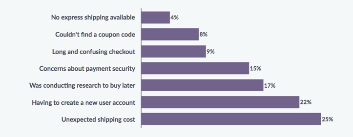
The following chart shows reasons abandon their shopping carts, resulting in loss of sales.

VWO eCommerce Cart Abandonment Report 2016
Let’s analyze these percentages and see which of them can be reduced if we involve UX professionals in the project:
Long and confusing checkout (9%)
Possible Solution: Simple and particular user flows that adapt to the mental models of users.
Concerns about payment security (15%) – Unexpected shipping cost (25%)
Possible Solution: Develop a clear content strategy and maintain an adequate research process. That way, we can prevent the user from having ‘bad taste surprises’ when it comes to interacting with the product or service.
Having to create a new user account (22%)
Possible Solution: If you are reading this and have a site where the purchase process requires a previous registration, consider the option of adding a “Guest Checkout”. This concept, as its name explains (guest purchasing), allows the user to make a purchase without needing to register or log on the site.
Each project and context is unique and each solution will be unique based on the needs of the user and the client.
If we add the percentage of abandonment of purchase previously listed, that gives us a total of 71%. This means that if you invoice $100 per day, you could be allowing another $70 to slip away with users who are leaving your site. That is, if you are unfortunate enough to suffer all these UX problems simultaneously. For these particular conversion problems, this ROI makes it cheaper to pay a good UX professional to help you out.
3. Redesign Costs
Lack of awareness about the importance of the user experience has unimaginable long-term costs. A common mistake that is often made is to speed up the design process. Unfortunately for those who choose this route, this has more than verifiable consequences in the medium and long term.
A design that’s not backed by a suitable, adequate research process will most likely result in a product that does not fit the market. The product will have to be redesigned after a thorough investigation of the market and the target users.
If the users for whom we design are not the same that will use the application, it is more than likely that complaints will be made by users for not meeting their needs. If their needs are not met, complaints begin to surface and the product/service owners begin to suffer the negative consequences. Suppose they detect that such complaints are the product of an insufferable user experience. As a result, you have to invest again in a design. With luck, this time you learn the value of the user experience!
A poor user experience design ALWAYS ends up having a negative impact on the users who are going to decide whether or not to use the product / service. The only scenario where this might not be true is if we were talking about an intranet or something similar where users are forced to use the product. This is a good time to point out that bad UX can also cause your employees to suffer a huge drop in productivity!
“A poor UX design ALWAYS ends up having a negative impact on the users who are going to decide whether or not to use the product or service.”
Valentin Zamorano, UX Designer at Making Sense
Try to understand the value of thinking in the user mindset. You’ll want to approach the design process in a way that the first thing to be taken into account is the collection of data to generate a hypothesis.
Then, generate the best possible solution for the users and the business. Some say that a functional design is more important than a design with great visual impact. Not that the visual is unimportant, but a design that has a solid research process will almost always be functional. There’s always time later to make it cute (however, it’d be nice to achieve both, a beautiful functional design).
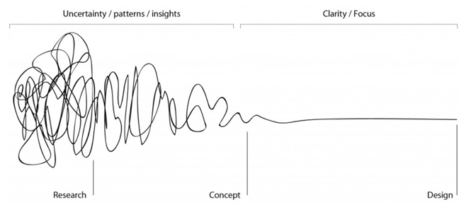
Here’s a graph that explains the UX process visually. As you can see, the process starts with a lot of uncertainty, with backs and forths, and as we answer questions, we start to develop a concept that adapts to the needs of the users and the business (which are detected in the research stage). Finally, a functional and aesthetically attractive design is created that embodies a clear vision of the project.

—
In this article I tried to describe some of the side effects of bad UX, from quantifiable to economic to psychological. In doing so, I hoped to convey the great value of dedicating the necessary time to the UX of a product or service.
Why do I care so much? It’s not only my job but also my passion. More than being a designer and applying technical knowledge, I like being a consultant or consultant of the clients with whom I work at Making Sense. It’s exciting to generate relationships built on trust in which everyone feels that their interests are defended. In turn, I get to be the mediator between the objectives of the users and the client. To me, it’s a dream job!
And I ask you now … do you value the experience that your product / service offers its users? When was the last time you talked to your users and asked them for their opinion?
