Despite a reputation for resistance to innovation, the healthcare industry is finally joining the technological revolution.
That’s great news, since it means improving patient outcomes while providing cost-effective care and enabling real-time information-sharing between care providers and patients. All this is critical to the healthcare industry and, of course, to the people whose lives are impacted.
It was from this mindset that our partner came to us with the idea of providing a more personalized patient interaction. He wanted to create software that would bring patients and doctors closer together.
To guarantee that patients receive outstanding care, we needed to create a platform that could be used across the web on tablet devices. So we implemented a Shift-Management System called Reformd Care, dedicated to helping patients to quickly and effectively schedule medical appointments.
How does it work?
When a patient visits their doctor, the medical assistant will offer him/her the option of making an appointment by subscribing to Reformd Care. By agreeing to a monthly or annual payment, they gain priority over other patients for their next appointment.
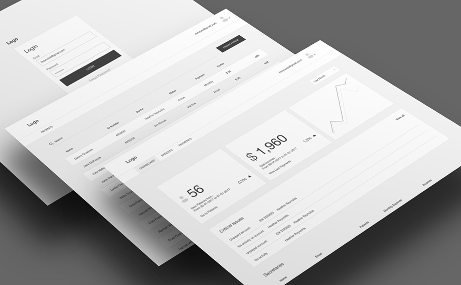
The system needed to address the concerns of three different types of users: medical assistant, doctors, and administrators. It also had to present an easy interface to all three populations.

The Process
We started our engagement with a Discovery Phase, since it’s designed to help our clients during the early stages of the project. A key goal of the Making Sense team is to understand the client’s business, which is elemental to making technology and design decisions that support overarching objectives.
We had a multidisciplinary team that during the next two and a half weeks were in charge of the following:
- analyzing the behaviour of customers and competitors
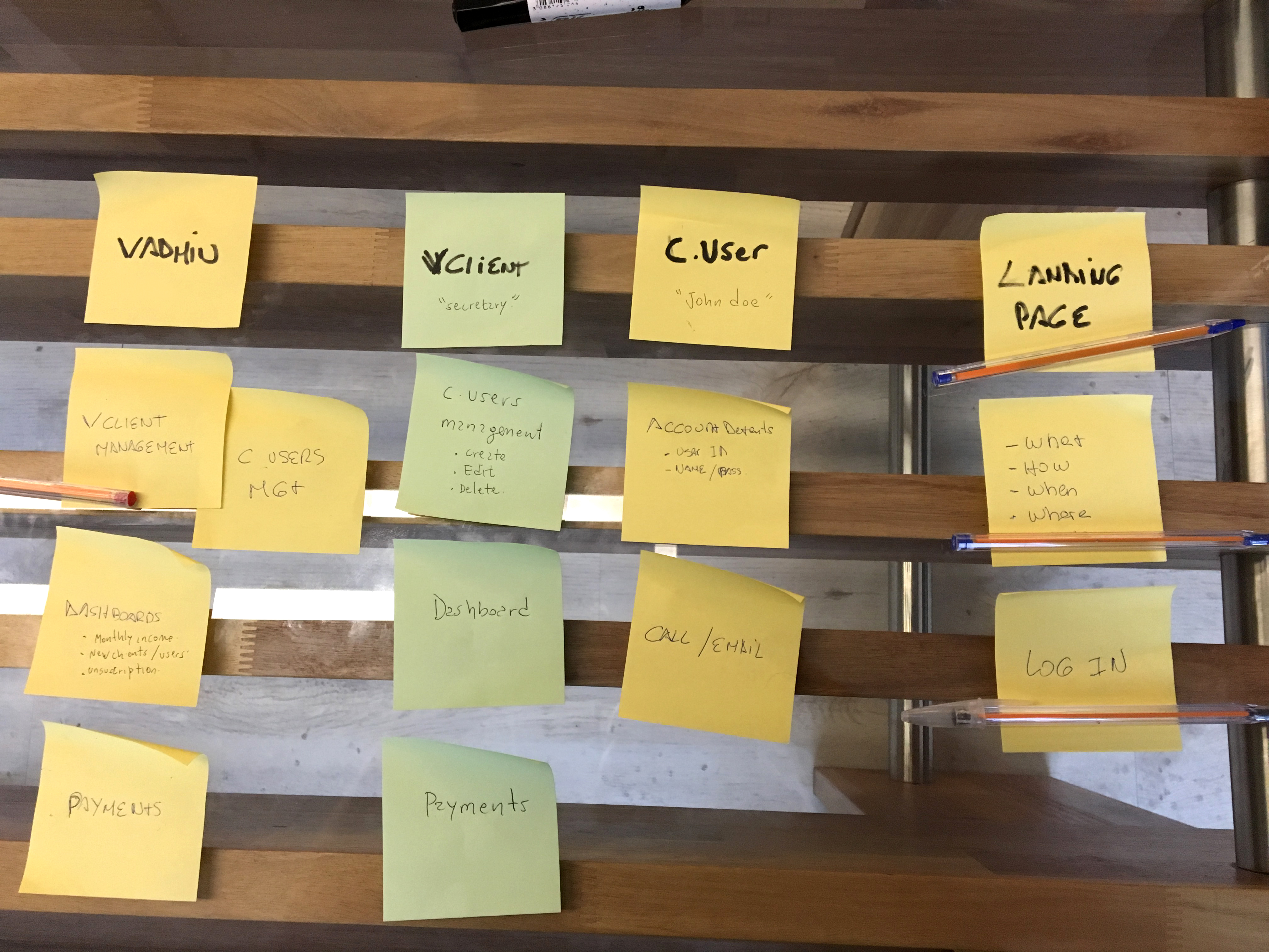
- implementing User Scenarios, Personas Documentation, Sitemaps and User Flows
- defining the architecture
After working out the details of the Discovery phase, the foundation of the project was established.

MVP: Here We Go!
The Making Sense team for this project consisted of a core group of one front-end developer, one back-end developer, and a QA engineer. A Project Manager, a Business analyst, a UX designer and a UX Developer were also needed to tackle this project.
Based on the results of the Discovery Phase, our team decided to work on Angular. Our UX Designer analyzed the different user flows and scenarios, and together with the Business Analyst they created the user stories.
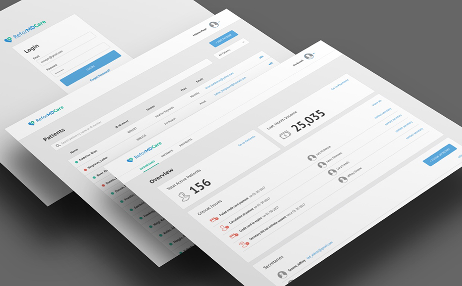
We conducted an intensive analysis of the different types of users from which the different functionalities were determined. Also, it was necessary to develop the brand. Taking into consideration the industry in which the product was going to be inserted and the product itself, we provided our client with a brand identity, logos and a defined color pallette.
Despite all the new features that we added, it was crucial to stay within budget. So we had to be constantly aware of the essential features that would shape the product in the best way possible. Of course, there were certain items which were left for another development stage.
Recap: It Takes Knowledge, Experience, and Collaboration
To summarize, our team was able to apply their experience and develop an MVP whose code was scalable, reusable and independent. Then, during analysis, we applied our knowledge of the various possible scenarios for the product. From there, we made the best decisions, both aesthetic and functional.

With the Reformd Care project, there was a lot to learn in a very short period of time. But as is always the case, the easy collaboration between the teams really helped to flatten the learning curve and we met our goals.
The MVP is scheduled to roll out to the end users in the coming weeks. We couldn’t be more excited!
