In this first post of an ongoing serie, we will explain the main topics about Flat and Skeuomorphic design, as an introduction to the basic concepts of UI/UX posts. A lot has already been said about these two design languages, and the debate over which one is the best continues. We are not here to argue that; as a matter of fact, we are here to give you an introduction to both in case you missed it already. In this debate, two tech giants stand opposed to each other; Apple champions skeuomorphic design, and Microsoft favors flat.
Skeuomor… what?
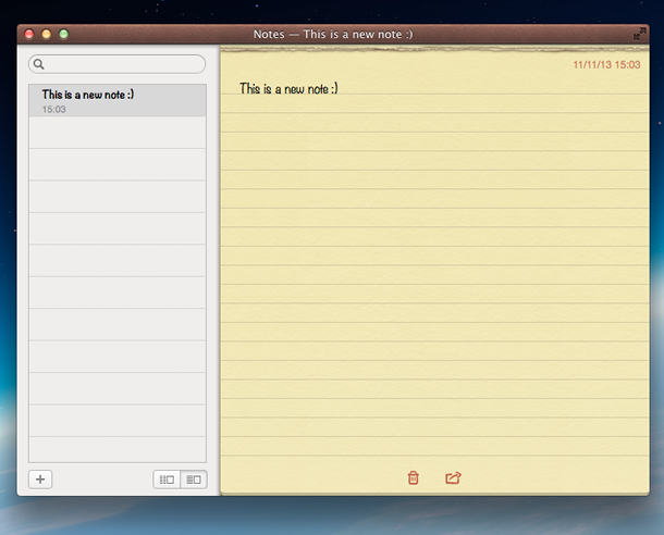
For the sake of simplicity, we can say that, in terms of design, skeuomorphism refers to an object that has features similar to a real object or element. Think about how folders look in your File Manager just to give you a an easy-to-understand example. No talk about skeuomorphic design is complete without reference to Apple. Apple’s operating system of the early 80’s introduced skeuomorphic elements; a relevant, and more recent example of skeuomorphic design is the Notes app in which you can see the movement of pages in a paper notepad simulated in a digital environment: striped areas at the top simulating torn paper along with guidelines and heavy textures to simulate the experience of using a physical notepad. Another app that follows the same design pattern is the calendar app.

If you read the Apple Human Interface Guidelines closely you will find yourself swimming in a sea of heavy drop shadows, deep gradients and textures designed to give the user the feeling he is actually touching every element even though he’s only viewing a digital representation.
The flat era
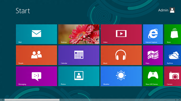
As a counterpart, and almost without even wanting to, Microsoft introduced the flat design language with Windows 8 Metro User Interface.

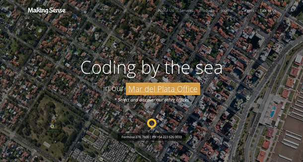
The flat design language deliberately avoids skeuomorphic design aesthetics (beveled edges, heavy gradients, shadows, reflections) and instead relies on single lines, subtle background gradients and plain colors to let the user focus on the relevant information and, of course, generating a rich user experience through the content and not by the “lifelike” design. Google was also one of the early adopters of flat design. Hint: If you want to learn more about the process of Google’s product redesign, I recommend you read this great article. You should also check our new website, which has been redesigned following this trend.

As you can see in the image above, we make use of subtle transparencies, single lines and plain colors just to simplify the interaction between the information and the map switcher itself. With the introduction of Responsive Web Design (a.k.a RWD; don’t worry, we are going to talk about that in the near future), the flat design philosophy became a trend, thanks in part to the inherent advantages it offers by utilizing the fewest number of images to recreate a functional environment for the content to be displayed, especially considering that most of the aesthetic aspects can be achieved using HTML and CSS.
So… who wins this battle?
Despite the fact that the skeuomorphic and flat design styles both have a considerable number of advocates and detractors, both are present almost everywhere in the digital world (maybe in too many places if you ask me) and both offer specific, distinct advantages, depending on your niche and communication strategy. I encourage you to have an in-depth discussion with your design team to determine which one you feel is best for your next project. What are you waiting for? Contact us today at hello@makingsense.com
