Speakers at this year’s An Event Apart in Austin were awesome. A big thank you to Jeffrey Zeldman, Eric Mayer and their team for staging such a great three-day event.
Takeaways and memorable presentations include:
Responsive Web Design presented By Ethan Marcotte
Ethan shows us how, with the ever-changing internet, we need to factor “responsive web design” into everything we do. Given the chance, he natters excitedly on the subject and has written a book about it too, where he explains how to think beyond the desktop and craft beautiful designs that anticipate and respond to your users’ needs.
UI Pattern Libraries presented by Sarah Parmenter
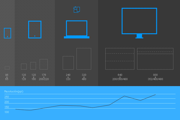
As part of her presentation, Sarah introduced the common breakpoints for responsive design:

Sarah also talked about user-interface (UI) pattern libraries. These make it easy for developers and designers to collaborate and build web apps faster. They contain project-related samples of HTML and CSS, wireframes, images, links and more. Common elements found within a UI pattern library include:
- Multiple sized buttons and hover states
- Contextual error, success and informational messages
- Lists
- Paragraphs with all H-Styles
- Headers with imagery
- Side navigation with adverts
- Blog-post layouts
- Cross-device navigation implementations
- Color watches
- Table layouts
- Forms
- Tone of voice examples (where applicable)
Designing for Mobile & Beyond, presented by Luke Wroblewski
Luke’s key message is to think strategically when deciding to follow the mobile-web or native-mobile route to mobile app development. He says you need to:
- Enable your websites and apps to deliver immediate value on mobile devices and beyond.
- Optimize navigation systems and menus for mobile devices and adapt them to a range of screens.
- Create layouts that factor in mobile’s unique capabilities and constraints, but without compromising large-screen designs.
- Understand the difference – and decide – between responsive web design, RESS and device-experience solutions for multi-device web design.
Luke also introduced the audience to signing into Windows 8 with a picture password. To make a password that’s more secure and memorable, you:
- Select a picture from your own collection.
- Use your fingers to draw ‘gestures’ on the screen. These lines and shapes highlight and connect areas of the image in ways only you remember.
- When you sign in, you’re presented with your selected picture. Simply repeat the gestures you logged originally and you’re in!
Here’s the video of how it works:
The Real Me: Personality In Design presented by Aarron Walter
Aarron poses the question, ‘If your website were a person, who would it be?’ He uses the concept of ‘design personas’ to show how personality can be channeled into a website or app’s copy, look and interactions. Thereby helping digital professionals construct unified and consistent experiences. Here’s an excerpt from his book, including an example of how MailChimp does it.
Less Is More
With An Event Apart small and intimate, I took away something new and important from each presentation. It’s an amazing event the whole Making Sense team was delighted to attend, and we look forward to coming back next year.
