With the restrictions in the physical world brought on by Covid-19, companies have had to increasingly accelerate their digital transformation and focus on UX to stay relevant.
Many companies that had little online presence have had to scramble to modernize apps and online payment systems and offer a good experience.
How are UX trends changing in this new scenario? First of all, it is important to dispel certain myths.
One of these is that UX is on its way out, that given the many UX visual tricks that can now be automated, the days of UX designers are numbered.
Not so, say Making Sense UX designers Martin Deniro and Florencia Vispo.
“UX is trending. Obviously, we rely heavily on patterns, UI Frameworks and different tools but that is only a small part of the UX designer’s job. The most important role a UX designer plays is to deliver the best experience, ” says Vispo.
“Each experience has a particular condiment and shouldn’t reuse the same monotonous templates,” she adds.
All that glitters isn’t gold
Experience is the operative word here, says Deniro.
Every year is marked by a series of visual trends in UX like gradients or colors. But it is important to know that these are often passing fads and do not constitute a long-term product strategy. Smart visuals on a website can help position a brand or generate content and be more relevant for retailers and e-commerce companies but can also become obsolete in one or two years.
But Making Sense’s clients are typically from sectors such as healthcare, agricultural or construction and focus more on creating deep-seated improvements to the user experience.
“In my case, I always prioritize functionality and accessibility over making it look nice,” said Vispo. Obviously I’ll make it look good but only certain sectors have to be trendy.”
What can we expect in 2021?
Microcopy: small words with a huge UX impact
Microcopy are tiny tidbits of text found on websites, applications, and products that tell users what to do, provide assistance or contribute to telling the story about your brand.
These tiny words may seem insignificant when compared to the overall app design but can have a huge impact on conversions.
“With an increasingly large and diverse customer base it is important to generate friendly engagement to create trust in that relationship,” said Vispo.
Onboarding
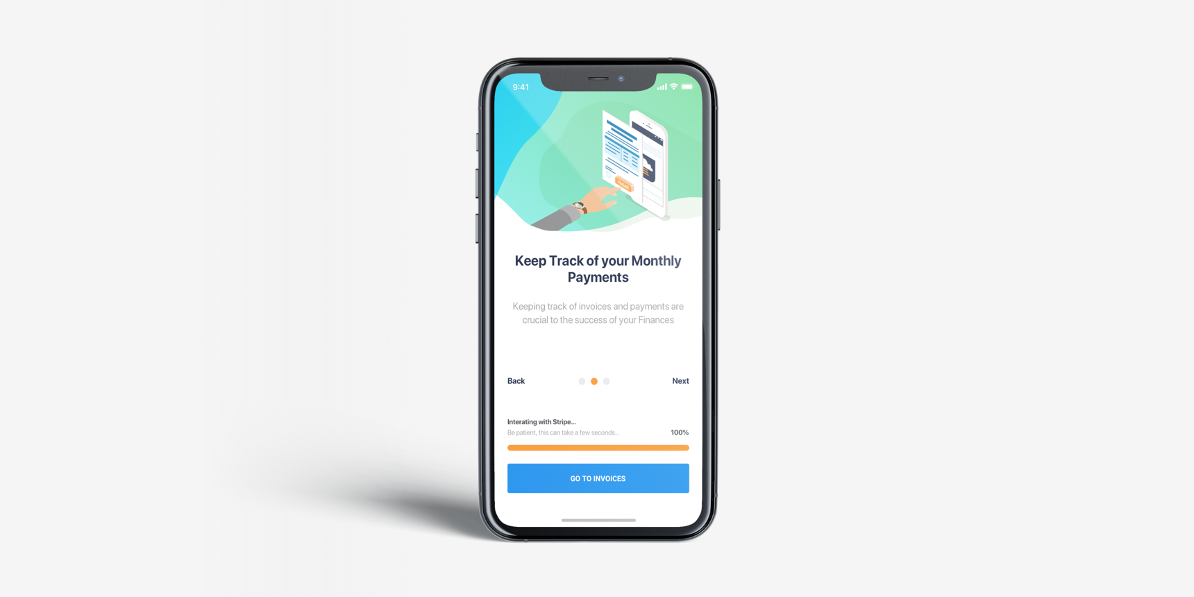
Microcopy is not a new trend but is increasingly helping with other interactions on a website like onboarding, where new users are guided through the exciting experience of joining a Digital Product.
According to Deniro, ensuring a good onboarding experience can mean reducing the amount of data a new user has to provide to register, explaining the core features or receiving a reminder to complete their registration process in case of abandonment.
“It’s more communicational than visual. It is more about communicating the right information at the right moment,” said Deniro.
For example, we can see the next example where there is an integration happening so we take advantage of that momentum to explain the app core features.
Micro interactions – one small experience goes a long way
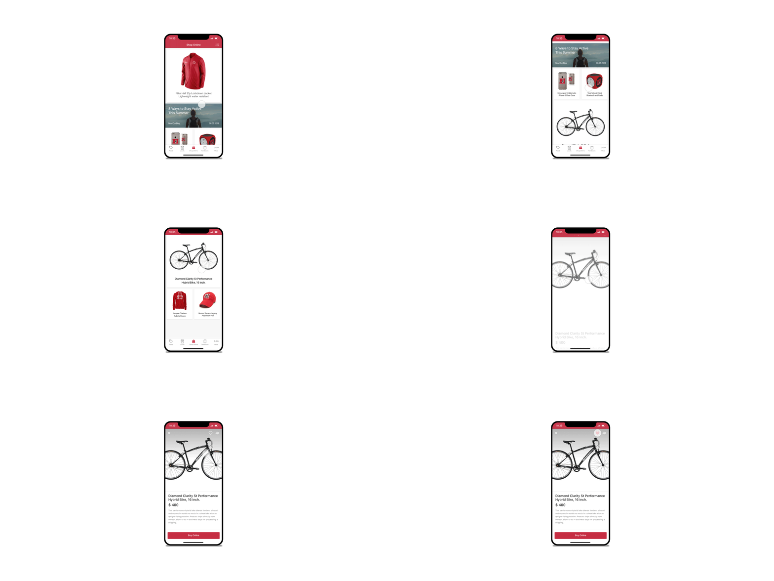
Micro-interactions are small interaction moments in a design whose main purpose is often to delight the user; to create a moment that is engaging and enjoyable. They trigger feedback on a website or app. Examples include: swiping, scrolling and clicking; liking sharing and saving; turning volume controls up or down; or viewing some sort of animation.
“Micro interactions are sometimes not set as the highest priority in the roadmap but have a lot of added value,” says Vispo. “They help engagement and have a wow effect and make a difference to the user’s experience on a page. These ‘delighters’ are often barely noticeable and remain in the subconscious mind and are impacting our intuition.”
Gamification
Gamification is becoming an increasingly popular trend in UX. This user-centered approach creates game mechanics to encourage users to have fun and engage more, by introducing a game element such as a challenge. Users can be challenged to check-in every week and be rewarded for doing so by earning virtual badges or stickers or points which can later be used to purchase items of the website, for example. The end goal is to make the interaction with the product as easy and understandable as possible and for that to increase the customer conversion rate. Gamification is often seen in the retail area or is aimed at more sophisticated users, particularly the younger generation.
A good example of gamification is ‘Shop Your Way’, a free social shopping destination where members can shop, compare, purchase items and earn points to use for future purchases.
Let’s get Visual! Visual!
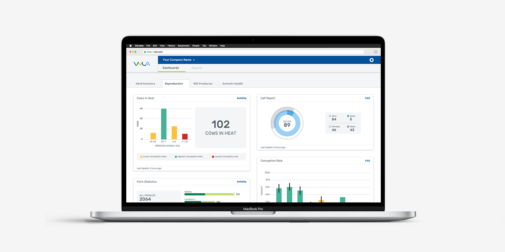
Data visualization is also not a new trend but really started seeing mass adoption in 2020. In short it means representing cold hard data in graphical or other ways that are appealing or easier to digest. That could range from a graph to a 3D animation.
“In several projects, we have to deal with a large amount of information and there is a lot of potential for what you can do with it. The added value really has a lot to do with the way you visualize the information,” Deniro said.
Voice-user interface
Voice UI technology, which makes spoken human interaction with computers possible, will increasingly be used to boost UX experiences in 2021.
This could lead to a decrease in the relevance of mouses, keyboards and graphical interfaces over time and impact the SEO industry in the future, although there is still some way to go yet. In 2021 more websites and apps will combine voice-activated search with the traditional search option. Early adopters could be certain population segments like the elderly or people with visual impairment. UX design may be tailored to those needs.
Keeping in touch
Online live collaboration has become a key element of UX in the last year as companies and educators shifted from physical to digital spaces, conducting much of their business via video platforms. While this might have brought some inconveniences, technology has done a great job in providing the tools to maintain efficiency and remote collaboration.
The traditional whiteboard has gone digital and in many instances teams have become more productive as they can include input from more participants.
Technology is advancing and as devices become more and more sophisticated that opens up many possibilities for doing higher resolution videos or 3D interactions.
At the same time, users have many stimuli competing for their attention so it is important to avoid stimulation overload.
So, in summary, forming a long-term partnership with a client focused on creating the best user experience is the best course of action. Iterative design allows designers to create and test ideas rapidly and discard those that fail to show promise. This is a cost-effective approach which puts at the users at the heart of the process and leads to the best results.


