A little over a year ago, we saw a great idea beginning to take shape. The process of turning ideas into reality is exciting and challenging. I also think there’s something magical about it: I am always fascinated to see what each person imagines and to witness the pieces gradually fitting together. The different ideas synergize and enter a cycle of constant change and evolution.
I feel lucky to have been part of that process (which is still ongoing, as the project is currently in beta stage), so today I want to share it with all of you.
The idea that started everything
The original idea was to create a space for fusion: different companies sought to enhance each other’s expertise. This meant understanding different business models, users and needs:
On one hand, companies that provide genetic material for animal reproduction ( Alta and Genex) wanted their consultants to have more and better access to their clients, so they could work on more sophisticated genetic plans.
On the other hand, dairy managers (VAS users) who need to reproduce their cows in the most efficient way possible, had to understand how and why a genetic plan best suited their needs, in order to have more active participation in decisions.
When a dairy manager needs genetic material for his cows, he meets with a consultant and together they look for the best match.
Our work was to create that shared space where users from each “side” come together (to complement the experience and information each one has), in search of the best possible result. We had to create a system that provides them with all the data, calculations, and tools. But most of all, we needed to create a working team: Consultants, Dairy Managers and Us: Urus.
Hands-on work: Designing for highly trained users
I had been designing for dairy managers for a while, so luckily I wasn’t starting from scratch. I understood some basic concepts related to the health and production of cows. But when it came to breeding and genetic planning, I felt totally lost: How would I be able to help our users handle such complex data sets?
I started by analyzing the systems that our consultants were using up to that point, including reports, documentation, and more. At the same time, my teammates did analysis and research from their roles and perspectives, and we tried to help each other. But it was a very specific and complex universe.
As a UX Designer, I always seek to put myself in our users’ shoes. But these shoes were too big for me! After all, our users are highly trained professionals working in a highly specialized field. It made sense that it was not so easy to speak the same “language.”
I decided to go one step back: I signed up for an online course (“Genetic Models for Animal Breeding”). That was a game-changer!
Now I could understand a good part of the reports, the data sets, the steps they had to follow, the configurations, and the decisions they had to make. Obviously, I did not become an expert (not even close!), but at least I armed myself with basic tools to understand the world of our users. I was able to start asking myself (and asking them) questions. And I began to become aware of the real challenges we were facing.
Below you can discover the 5 main challenges we had to face, and how we solved them:
1. Multiple types of Users
This was one of the first challenges: designing the same product aimed at very different types of users. While the more experienced consultants expect to have fine control of all the variables and settings, the newer consultants are often overwhelmed by all the options and their implications for calculations and algorithms. On top of that, we must add the Dairy Manager. Although this user won’t be the one who manages the software, he will be a witness and an active participant in the decisions (as he is generally in the same physical space, working as a team with the consultant). In addition, he will be the one to finally buy the genetic plan, so it is vitally important that he understands everything that this plan entails.
Containing different levels of complexity in the same product was possible thanks to meticulous work in its organization and hierarchy:
- We focused on the frequency of use and the priority of the actions to give more hierarchy to those that were mandatory or used by the majority.
- We build a consistent application to make the user feel safe. For example, complementary settings or actions can always be found following the same pattern (the same type of button, located on all screens in the same place). This prevents the user from having to figure out a riddle every time he searches for something outside the ordinary pattern. Building a genetic plan is hard enough!
2. Too much data everywhere
Building a genetic plan for a large group of animals is not easy. If you want to get accurate results (for example, animals that produce more milk or animals that have fewer health problems), you must rely on accurate data and sophisticated calculations.
The data, the calculations and the algorithms have to work together with the users (who have the experience and decide where they want to grow, after understanding their possibilities).
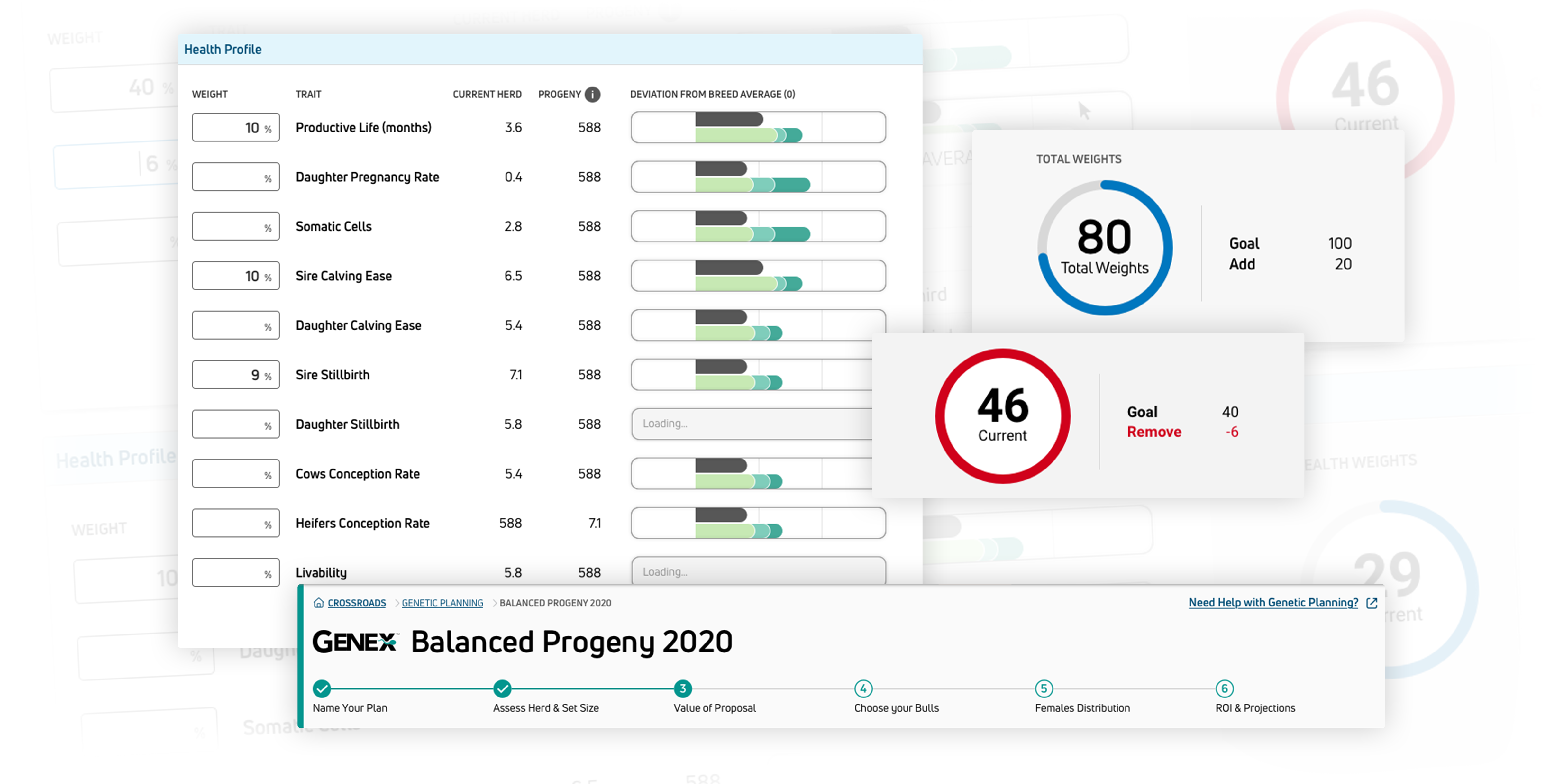
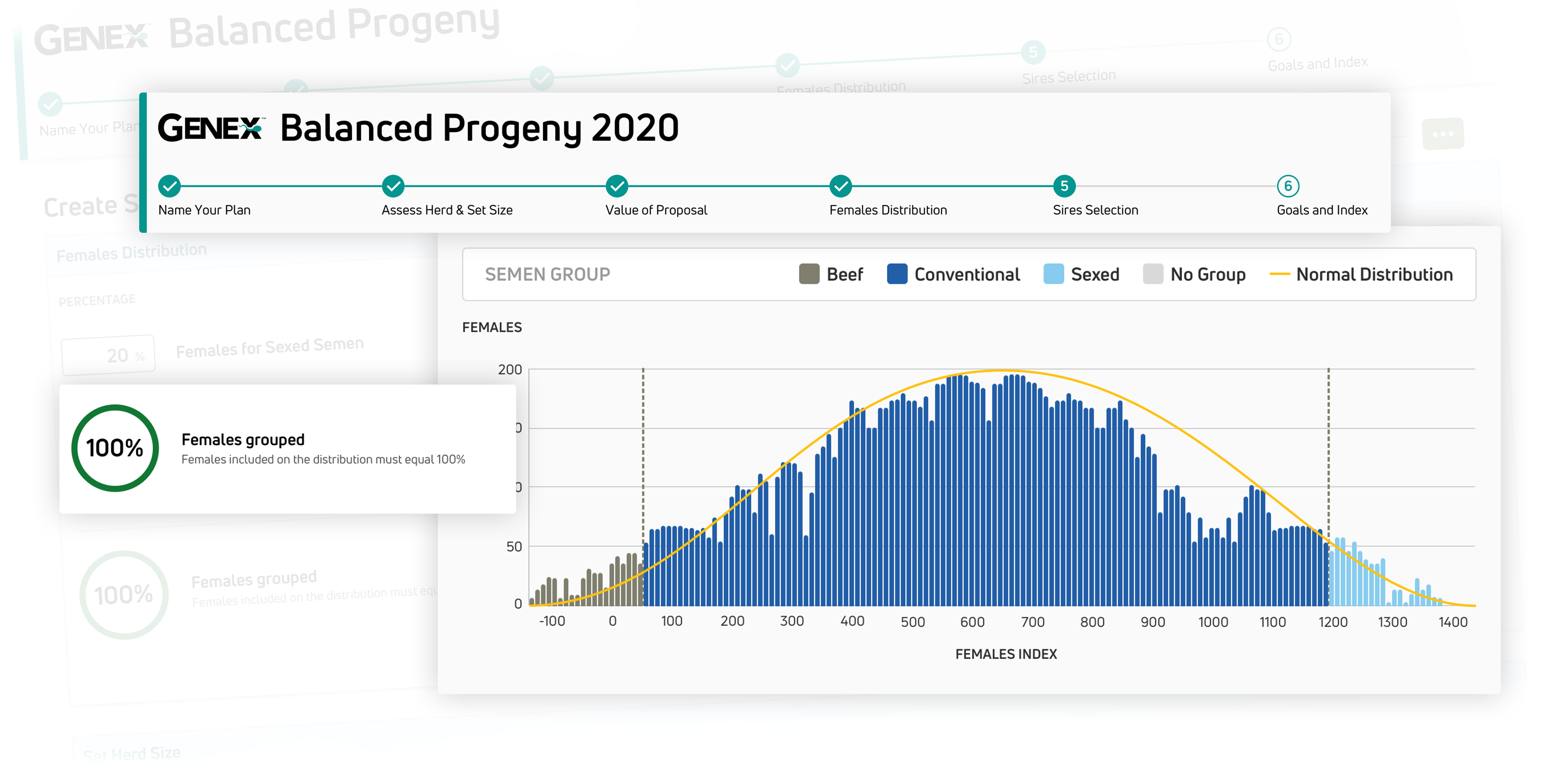
For this, you have to handle a large amount of data. For each animal and each potential candidate, a large list of traits, pedigree, and compatibilities must be analyzed.
A genetic plan needs many decisions, actions, and data to perform. Too much of everything! So, this is what we did:
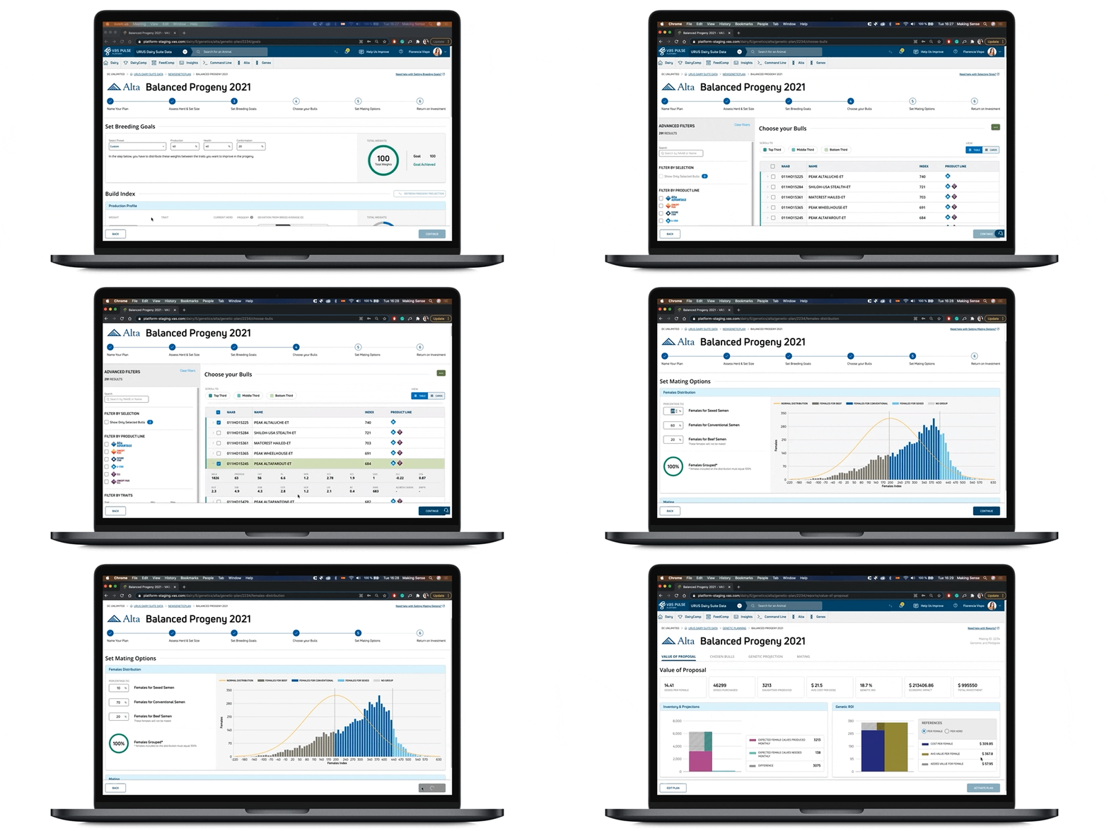
- The concept of progressive disclosure was key to facilitate the understanding and use of the application. We deferred advanced or rarely used functions to a secondary screen and we organized the actions in doses so as not to overload the user, by creating understandable and assimilable units.
- We sought the balance between actions and information. For this, we had to analyze what information was necessary for each action and decision that the user had to take. We wanted our users to have the necessary information at the right time. No more, no less. In this way, we showed the user the minimum and essential block of information in each step.
3. Old habits die hard
When an app modernization process is carried out (as in our case, there is a legacy app that precedes us through one of the companies involved), it brings with it a set of habits and expectations.
In our case, we could see that many habits of our users were rooted in that legacy application, which was very limited by technical possibilities. That is, many actions were not intuitive or lacked common sense. But they were the best way they had at the time to solve something.
The lack of intuitiveness made learning to use the tool a complex process, requiring robust training. Not good for new consultants. But above all, extremely challenging for dairy managers, who could not fully understand the genetic plan that was being built and actively participate in the process.
How do you break such an ingrained habit? We knew (our users included) that there were many processes that could be simplified. But at the same time, “re-learning” requires effort.
Now, with new possibilities from a technical point of view, we needed to question many of the expectations of our users. Our best tool was asking “Why?” or “What for?” Sometimes that revealed that they expected to do something in an unnecessarily complicated way.
- Understanding the real need and the root of the expectation is key to simplifying and building a more intuitive product.
- Our expectations as product developers can also be revised. It is not realistic to pretend to have a perfect product on the first try. Constant iterations lead to constant improvement. Change can happen progressively, giving us time to step back, reassess, understand, test, and start over. Finding the balance between the new and the “original” is a journey that continues to evolve even today (currently, through our Beta Testing stage).
4. Technical limitations can be REALLY limiting
Technical limitations are still a reality, as managing huge databases comes at a cost. This includes actions that take longer than desired to customizations that are not available. The technical limitations are varied.
From the user experience side, we must soften the moments in which these scenarios are generated. I think being transparent and communicating honestly is the best way to cope. And (if possible) we can help the user find other ways or other options to cover those limitations.
5. Selling a promise
The data, in this case, is not just a nice accessory. In fact, the data (the pre-existing and the new that is calculated) become the building blocks of this entire product. They are the only protagonists.
When a consultant makes a sale effective, along with those small doses of semen, he is selling a great promise of growth. A promise that is based on consistently recorded facts, analysis, science, calculations, and projections. A promise that is not gone with the wind, but is realized, tracked, and analyzed so that the cycle begins again.
So, what makes the difference is the story that we tell through the creation of the plan. It is essential that the data is not just hard data. We want the data to be understood. We want to build the history of these growing herds with data. Data comes to life and takes on importance and meaning when it is immersed in context, deeply understood, and makes all the pieces connect.
Wrap-up
Working with hard data can be hard. But if you dive into it, the process can be very exciting. It’s essential to understand what the data set is about and how the user can draw on it to collaborate within their needs.
Working as a team is also essential. It would not have been possible to get the understanding we achieved if not for each of my colleagues and stakeholders, who collaborated with perspectives of knowledge and experience.
We can have millions of interesting data sets. But the value of that data can change depending on what we do with it. At Urus, we maximized the value of data consistently saved for generations. We literally made it come alive with each new animal that surpasses its predecessors in productivity, health and composition.
