This is a ‘big data world.’ Though it’s great how much information you can get about anything (your audience, your business, yourself) sometimes it can be overwhelming, don’t you think?
We humans have limited resources and capabilities. As much as we want, we can’t absorb everything around us. We can’t comprehend everything as if we were in the Matrix, just by transferring knowledge to our brains within a few seconds. Considering that, how can we make the most of it? How can we avoid drowning in the sea of data that surrounds us? Data storytelling adds some human perspective to the complex and constantly changing world of the digital era.
A matter of perception
Have you ever looked everywhere for your keys for a few minutes that seemed eternal, and finally realized that they were right in front of you?
Have you ever kept something very well stored so as not to lose it, but later you can’t find it?
Have you ever retraced your steps to see if you had closed the front door?
What do all of these situations have in common? Perception. According to what and how we perceive, we don’t see the keys within plain sight, we don’t know if our memory of closing the door is from today or yesterday, we forget what we stored so carefully…
So, the fact that large amounts of information exist and are within our reach doesn’t mean that we are perceiving it, breaking it down, using it. Our perception and memory are limited. And the way we perceive the world around us has a direct impact on the way we think and the decisions we make.
When we face a data set, we must undergo a complex task of selection, analysis and understanding. This first stage is exploratory. It’s like diving into an immense sea of data, exploring for an object with potential value. But the work doesn’t end at this exploratory stage. Next what has been found must be shared: the explanatory stage. Let’s take a closer look at this second phase now.
Exposing raw data to all users is often pointless. Why would we make everyone go down a long road when we can provide a shortcut? Continuing with our metaphor, when many people can benefit from that knowledge found at the bottom of the sea, it’s not necessary for everyone to put on their diving suit and jump in to search.
Not everyone will have the ability to do so, or the time and desire. Thus, it’s enough for someone to bring what’s most valuable to the surface for others. This individual will become a facilitator and will create a shortcut that creates the path for many others. That’s what data storytelling is all about. Sharing information in a way that’s accessible, understandable and interesting. To give information room for its potential to shine. To facilitate tasks and strategic decision-making.
Stories as conductors of knowledge
We are made of stories, we live by and through stories. With stories we learn, we connect, we understand, we project… We consume stories all the time, on social media, in books, through movies.
Theorists suggest that storytelling was the primary form of knowledge transmission between large groups of people, shaping cultures as we know them today. So it makes sense to treat information in the same way. It’s more important than ever to be able to communicate data in a way that’s comprehensible and memorable. That’s called data storytelling. Data storytelling is a skill. Data storytelling is a methodology to transmit information to a certain audience in a way that facilitates its absorption.
A large amount of data dumped in a monotonous and random way on dashboards or spreadsheets is just that: piles of data. To leverage the data, you need to bring it to life through narrative, in order to effectively communicate information and insights.
Ideally, this would lead to some Eureka moments, new insights and discoveries, and would speed up the time required. In summary, it would help people carry out tasks more efficiently!
How we do it?:
Understand the Context
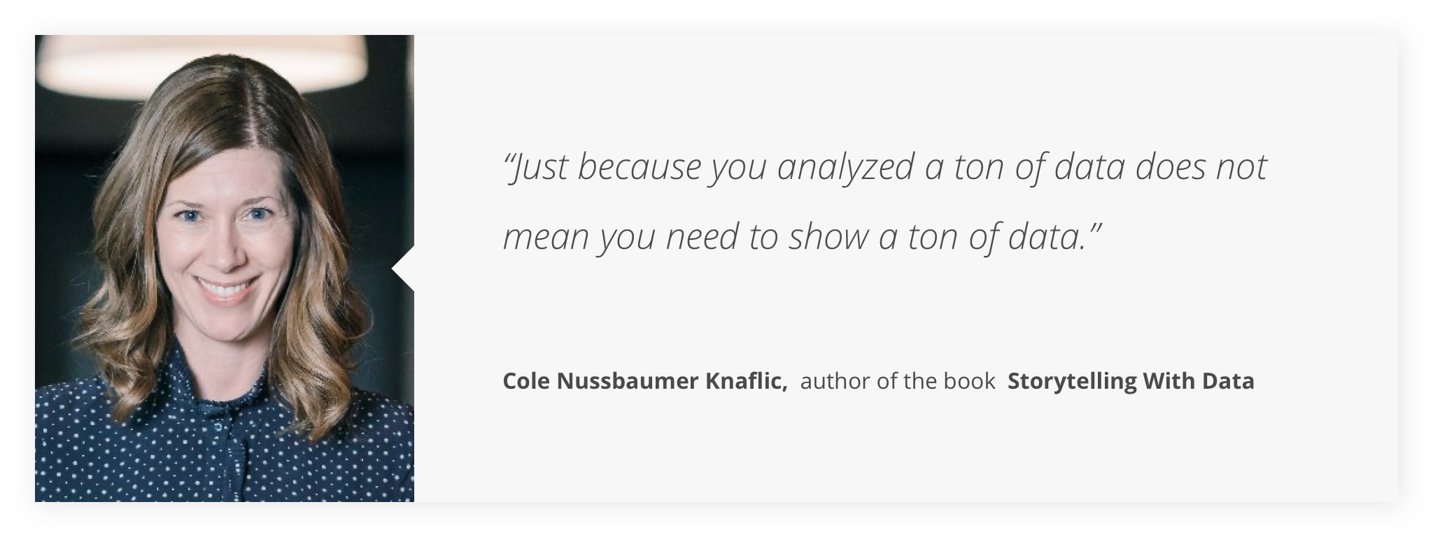
How much information to show? What information? How to show it? There’s no single answer to all of these questions. It all depends on the user. That is why you have to frame the content according to who will be exposed to it. Like when we take a photo, we focus or leave something out of the frame. The same we have to do with our data. “Just because you analyzed a ton of data does not mean you need to show a ton of data,” says Cole Nussbaumer Knaflic.
Some users will prefer minimal and simplified data. Other users will need robustness and details to trust the data and the underlying methodology. So, start by considering your users, their needs, the tasks they need to carry out, their previous knowledge, their priorities, their contexts of use. Then apply this user understanding to guide how much and which data you incorporate.
In addition, we have to speak in the same language, use words and terms that are understandable to the user. We must assess the prevailing situation. It’s not the same, for example, to speak to an expert user than to make insights more accessible to “the masses.”
If we speak in terms that are too technical, we will build a perceptual wall and the focus of attention will shift to that conflict point. We want to simplify the work for our users. Talk to them in a way that doesn’t require extra effort to understand.
Abstract and Focus
Once we define how much data and what data we need to display, it’s time for abstraction. When it comes to transmitting data, the visual effect is critical. 90% of all information that is transmitted to our brain is visual. People remember 80% of what they see and 20% of what they read.
This abstraction process is about translating domain-specific aspects into visualization vocabulary. It’s about finding the right visual encoding so that the user can read, manipulate and make the most of the data. Choosing the correct visual representation for each piece of information is essential so that the information is understood.
But that’s not all. We must choose a way of visualization that helps to focus and direct attention in the most efficient way, taking into account the visual tours that the user can take, the basic principles of gestalt, etc. We already know that our attention is limited. So if everything is trying to get our user’s attention, we will only make them feel dizzy. Keep it simple, decide what needs the most attention, and highlight it. The perfect display should not only communicate clearly, but also be stimulating to the user’s eyes and attention.
Create the story
Understanding the context and knowing how to effectively transfer data visually is an essential part of data storytelling. But we still need something else: turning data into stories. We must bring them to life.
We don’t want to just put one piece of information next to another. Not only because that does not represent reality (events don’t happen in isolation), but we want to make it easier for the brain to generate relationships, ideas and decisions. The articulation of a story can be very powerful. Clear areas for improvement can be recognized, as well as the acknowledgment of the actions that can drive those improvements. Stories are much more compelling and memorable than just facts. Make the data speak to users.
For that we need the basic components of a narrative: Plot, Twist and End.
The Plot should include the necessary context to understand what will be told.
The Twist is a significant change or event that deserves attention. What is interesting? What do the facts show us?
The end is a “call to action” that users will have to respond to. When we talk about data, there’s not always a single correct action possible. That’s why we shouldn’t always show data conclusively. But it does have to be engaging and impactful enough to inspire a response and help to take action. So rather than a fixed event, the end should show a set of options or questions to trigger an action from the audience. The goal of data storytelling is to make an impact and inspire critical thinking for business decisions.
Data-driven approach
Data storytelling is a powerful tool for data-driven work. With these types of approaches, we effectively align ourselves with our teammates, customers, and stakeholders. We can come up with efficient reports that summarize the results of our research processes and the ways to apply the insights into our products. And when we work on data science projects, this is a ‘must-have’ to expose the data to users in a way that’s helpful for their tasks and decisions.
One way or another, we are constantly working with data. Knowing which approach can work best with our way of perceiving things and our needs is incredibly useful. If the data were sufficient, we could automate the tasks (and this will also require some data exploratory as well). But when we need to supplement our knowledge, we can build an amazing team with our data sets!


