
If somebody asks me what I enjoy the most about being a UX designer, I’ll answer…to get to know, understand, and try to enhance people’s lives. Digital transformation is making huge changes in the way we shape the world and how we do business. It allows us to envision and create a more equal world where everyone wins: business, and users.
In this competitive landscape we’re living in, success is measured by the difference we can make in our users’ lives, and for that, it’s mandatory to get to know them and find a way to meet their needs. Since each user is different – everyone has their own background, beliefs, education, personality features, and behaviors- we must strive to design for everyone making our product useful and helpful.
As UXers, we are the advocate of the user but we also have to contemplate and achieve business goals. So, when business needs are there because of users’ needs, we find a perfect opportunity to work for a more integrated world.
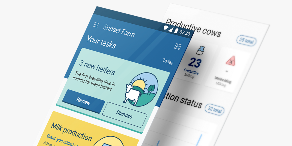
Since I’ve been working as a UX designer, I have participated in several projects that I have loved, but this one I am talking about today has a special place in my “projects podium”. It is a mix of opportunities: on the business side, to create and gain a new market for VAS – the leading dairy herd management software program in the United States, and a current Making Sense’s partner- and, on the other hand, to make the users’ daily work easier through technology.
The challenge
Many people in Latam are involved in farming activities, which represent a big percentage of the country’s GDP. Unfortunately, there is quite frequently limited access to technology that makes the farmer’s work less productive. So, our challenge was to improve management in small and medium dairies through a mobile application for farmers who have limited access to technology, and no less important, who have lower educational levels.
Designing for users with low educational levels
Have you ever received a brief that begins by defining your users as persons with limited writing and reading skills?
Well, that is how this journey began for us.
How can this kind of users interact with a management system? How can we help these users so that they feel comfortable and confident by using an app?
What does low literacy mean for UX design?
We started by investigating, looking for existing use cases, best practices, whatever was available to us. We found out that this kind of user tends to read slowly, word by word (high literacy users scan the text in order to find out the meaning), and usually struggles with forms.
Whenever there is a big chunk of text, these users tend to skip it and look for the next relevant piece of information and act upon it.
They also rely more on recognizable images than text and tend to follow preconceived interaction patterns over and over again: if something works, it will work the same next time a similar issue is presented.
Here are some rules we defined after researching this project:
1- Word by word reading
We decided to keep the labels simple and short, the same as explanations. Avoid embellishing the text with fancy words because they don’t need it.
Nielsen Norman Group recommends using text targeted at a 6th-grade reading level. This fantastic tool helps you double-check the written text so you can adapt your content to fit your target person. To keep things simple, use common words, avoiding adverbs and passive voice.
This tool would be the Latin sibling, extremely helpful for checking your Spanish version.
2 – User skips complex text
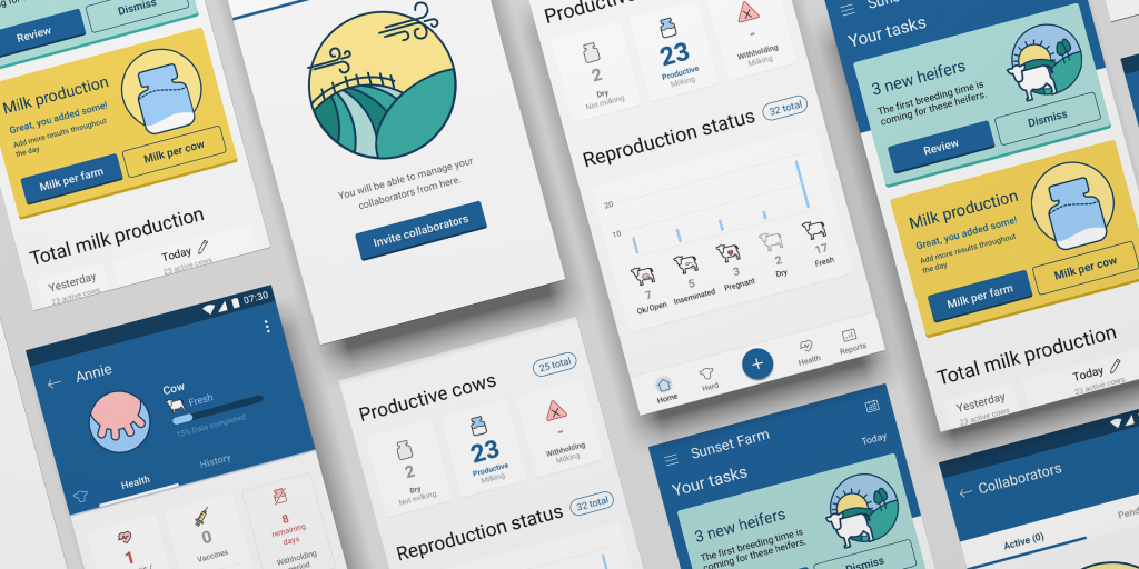
Let’s focus on a clear information hierarchy. To achieve this, we created a complete design system based on a clear definition of information components:
- Big titles
- Clean subtitles
- Neat call-to-action buttons
We also implemented the use of colors and solid backgrounds to make important information stand out.
3 – Make it predictable
Consistency across the whole app was one of the main key points. With careful element location and components usage, we focused on making the app as predictable as possible.
To ensure that elements and components would always have the same positioning, animations were avoided and non-available options were disabled instead of making them disappear.
4 – Visual help
We made use of icons and illustrations whenever possible. We also defined a simple yet recognizable aesthetics in order to consolidate ideas and concepts.
5 – Be nice and shorten your forms
Less is more when filling in forms.
We agreed to ask only for the least amount of information needed for the application to run.
We allow the user to add extra information later and on-demand.
Getting the user within the functional application as soon as possible was a high priority goal.
6 – Pay attention to basic accessibility improvements
Always check the visual contrast to ensure readability, and keep your text big enough.
Wrap-Up
This set of basic rules can (and should, IMHO) be applied to ANY kind of user and project, from basic to advanced, from simple to complex. These rules have become the checklist for all improvements or new capabilities in this or any other project that I am involved in.
Our main outcome of this challenging project was to always keep our users in mind, to learn about them, to understand them, and to try to make their lives easier in their own way. Having the whole team and stakeholders involved and committed in this journey was one of the most important elements for creating what we consider a great user experience focused on low literacy users, and honestly, any other kind as well.