As the Head of UX, my role involves not just leading a team but also reviewing the portfolios of UXers who wish to join Making Sense. My everyday conversations with my team, the events I attend, the conferences I go to – plus the portfolios I’ve looked at – have given me a good perspective on the UX industry and what kinds of expectations there are for the different UX positions that are out there.
Basically, I’m here to share with you some key points that we like to take into consideration when reviewing portfolios of candidates who have applied for UX positions on our teams.

A lot of time and effort goes into a great portfolio, but it’s a great investment if you can get it right.
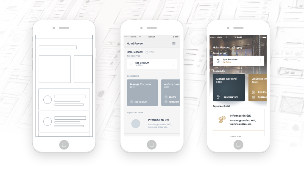
Putting the right content and doing a good job of explaining that content will help your future employers understand who you are and how you think – which is the real goal of a UX portfolio, by the way. It’s not just a collection of your designs. It’s there as a visual guide (with annotations!) to how your brain works.
It can all seem a little overwhelming if you’re just starting out in your UX career or if it’s been a while since you last had to show a portfolio and you’re feeling a little rusty. Here are my thoughts, for anyone who’s considering applying to work as a UX designer.
What we’re hoping to learn in a portfolio
When I review a portfolio and screen candidates, what’s most important for us isn’t necessarily what you can do, as evidenced by your portfolio. It’s what you can potentially do on a team here at Making Sense. In other words, we’re looking to learn:
- How you structure ideas
- What your work process looks like
- How you analyze a given problem
- Learning skills and flexibility

How can we see all that in a portfolio? Try and include the following types of elements in your portfolio:
- Problem Solving. Show a problem that you had to solve – explain what you did to solve it. Include details like a timeline, the obstacles, constraints, change orders, and how the product evolved between iterations to get closer to a better solution.
- Thoughts on Failure. Failure happens – it’s how we deal with it that matters. Show examples of past failures, your possible solutions, and how you arrived at a resolution that satisfied everyone and even what you would do differently now to be successful.
- A Design Story. Do some storytelling in your portfolio. Show your design process from beginning to end, let us see the evolution of a product under your wing.
- What’s Absent. I like to know why each element exists, why you chose it. But I also like to know which elements ended up on the cutting room floor. That tells me something about the kinds of choices you make and gives me a glimpse into your thought processes and who you are as a designer.
- Analysis. Give some post-completion analysis for each project in your portfolio. What did you learn as takeaways for future projects? Show how you’re always learning, aiming for continual self-improvement.
- Influencers. To get a full picture of you as a UXer, we like to know where you get inspiration from. Who are the people that you follow or admire? What books do you read? Podcasts? Do you participate in any list groups? We like to know!

A word about tools
Basic knowledge of the tools that UXers use is pretty much assumed. Tool familiarity is a fleeting skill anyway, and always subject to change as new tools come out. What’s important isn’t that you can use every tool out there, because which tools are important varies from person to person and from company to company and even project to project. And as time goes by, tools come and go.
What’s important is that you have the ability and especially the aptitude to learn new skills. Again, we’re looking for potential here – the potential to be flexible, open to new things – all things that are signs that someone is a good fit for team culture.

A tip on portfolio perspective
One thing to do, as you’re reviewing your own portfolio and readying it for submission, is to put yourself in the shoes of the reviewer. Think of the person reading the portfolio as a user.
What do users have in common?
- They might have limited time. Portfolio reviewers often have little time to devote to reviewing each project in your portfolio. So be concise.
- They have many choices. Portfolio reviewers usually have a lot of portfolios to get through. Be interesting.
- They are diverse. Portfolio reviewers can be someone like me, a fellow UXer, or they can be hiring managers, recruiters, or others. Your portfolio has to appeal to everyone, so in addition to thinking of the reviewer as a user, make considerations that not all users are alike. Again, be concise. Be clear, too.
A final word: process
Portfolios area typically thought of as collections of finished – i.e. polished work that showcase your finest work. However, in UX, it’s more of a showcase for your process and therefore a little “messiness” is called for. And by that I mean show your story, your struggles, your challenges, things you tried that didn’t work, what you learned, and what you accomplished.
We’re looking for a person, not just an employee- a collaborator, a team member and all that entails knowing how you work, not just what you produce.
So, final tip: be personal in your portfolio. Show the human side of your projects, what drives you, what makes you human, what you’re passionate about, and where you want to go, the kinds of projects you want to be part of in the future. In other words, round out the story of your projects with a story of the person behind them.
That, in a nutshell, is what we’re looking to see when we review portfolios here at Making Sense. If you are interested in being a part of our team, send your portfolio to careers@makingsense.com. Psst, don’t forget our advice!
