Redshift is a San Francisco-based UX agency specializing in the design of digital products and experiences. They dreamed of developing their own app: the first internal development to actually appear in-store. But as time went by and due to the urgencies of their day-to-day operations, that project suffered the effects of being relegated to the back burner. Client work always came first, of course.
When David, a mutual friend, introduced us to RedShift, we found that we could help them fulfill their dream.
Their challenge became our challenge as well. The plan was to take over part of the development, expanding until we had a final version. Making Sense had to ensure that the app was in production by the end of 2016. So we had to get right to work!
The goal? To build and launch an intuitive native app that people would use every day. It’s called Five, and it’s an easy-to-use iOS Application. What it does is allow you to share your Top 5 of anything, choosing from all different topics. Users can share, comment, or even add suggestions to other lists.

Let’s get the ball rolling!
This was a project in which teamwork between both companies was required. For their part, Redshift provided the design part of the project plus the UI / UX and backend developers. To complement those roles, Making Sense provided two iOS developers, a Project Manager and a QA. This was the team in charge of implementing, completing and improving what had previously been done.
Making Sense worked in a native mobile development, with great demands from the UX side and high expectations from the client.
Improvements
In order to avoid architectural issues that could show up while scaling and performance-tuning these types of large-scale applications, we developed the app in Objective-C. Features like Deep-linking and Push Notifications were implemented.

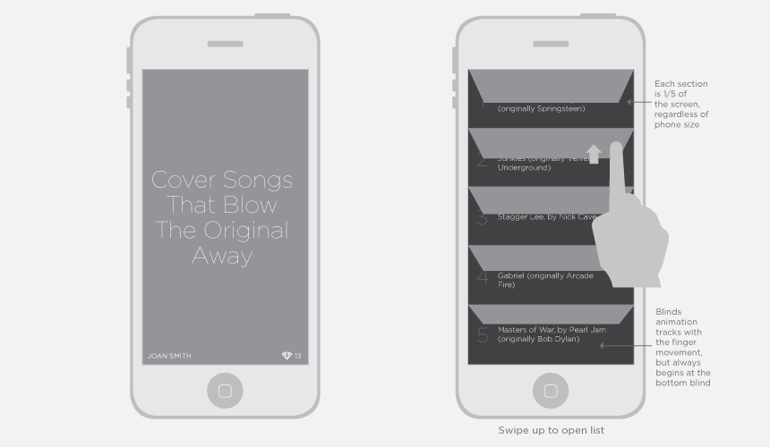
Wireframes used during the Development Process
As is normal in any project, we faced a couple of challenges during the development process. However, as always, we were prepared!
The biggest challenges were 1) working with an app that had already been developed and arranged, and 2) having to build on foundations that had issues. We took up the code that RedShift had developed 2 years ago, gathered the team, and analysed the best option for handling the obstacles we encountered. We started using better practices for the new features and we improved the old code as much as we could.

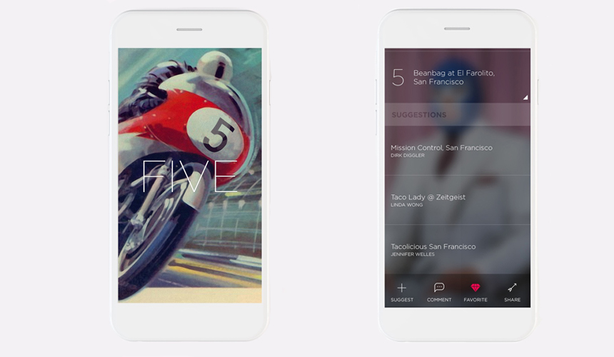
Screens of the App
Since RedShift is a UX-focused agency, and they provided mainly the design part, we had to ensure that boths teams were on the same page. This was essential! So there we were, trying to work together with their UX designer and of course, striving to meet his expectations.
It became a challenge in terms of communication and organization since some frictions popped up. Fortunately, we were very immersed in the project so we were able to overcome those disagreements, which of course are normal in the development of any project.
Results
Our mission was to deliver a fresh, user-friendly app. The new app is intuitive and the responsive design makes the app accessible across mobile. In addition, content is shareable across social media. Features were added and, as interaction was an important concept here, we focused our attention on providing an exceptional development approach.
We are very excited to announce that FIVE is now available in the Apple App Store. Download it now and have fun with your friends sharing your Top 5!
