Entrepreneurs and startups, take note: if you want to excel at developing mobile product ideas, you’ll definitely need to know about mobile patterns.
Mobile patterns provide all sorts of great benefits to the developer. Chiefly among these are the ability to optimize your development timeframe while staying within budget.
By using these patterns that exist for each OS, you’ll be able to launch an intuitive, usable, and attractive product. Below, we’ll show you how that works, along with some examples. You’ll also discover the advantages in the development process as well as the time you can save when using those libraries.
In short, you’re about to learn about the ideal framework for an MVP.
What is a Pattern?
First of all let’s clear up any confusion you may have about patterns in this context. The makers of iOS and Android provide different def controls and convention recommendations for interfaces that will be used on their devices. This helps to create standards and user expectations for specific devices.
Design patterns are best practices, inspired by other applications’ UI design. They’re called ‘best practices’ since they’ve been validated by way of long-term usage by their clients or because people have grown used to them due to frequent use by designers.
These design patterns are used in navigations, tutorials, forms, flow types, main actions and any other action required. Deciding when to use convention and when to be inventive is a big part of UI/UX design.
Why should you use mobile Patterns?
Using design patterns isn’t always a sure-shot for your app interface, but it’s a great starting point if you’re treading into unfamiliar territory.
Generally speaking, a UI design pattern is a reusable solution to a commonly occurring problem mobile UX designers might encounter every day.
It is a guide or template, that designers, developers, and product managers can use to solve common problems when designing a mobile application or system. Although it has to be utilized in the correct situation, it is generally language, device, although there may be technological limitations depending on how the designs are ultimately implemented.
Let’s take a look at some examples:
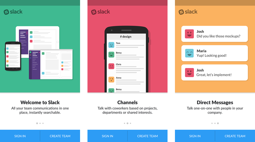
1. Walkthrough / Onboarding
There’s no more important moment in the user lifecycle than his first-time experience using your app. And making sure the first-time user experiences fantastic UX? Well it’s all about the onboarding. Even app designers whose products enjoy brand recognition still consider onboarding to be the most crucial consideration when it comes to user retention.
2. Navigation
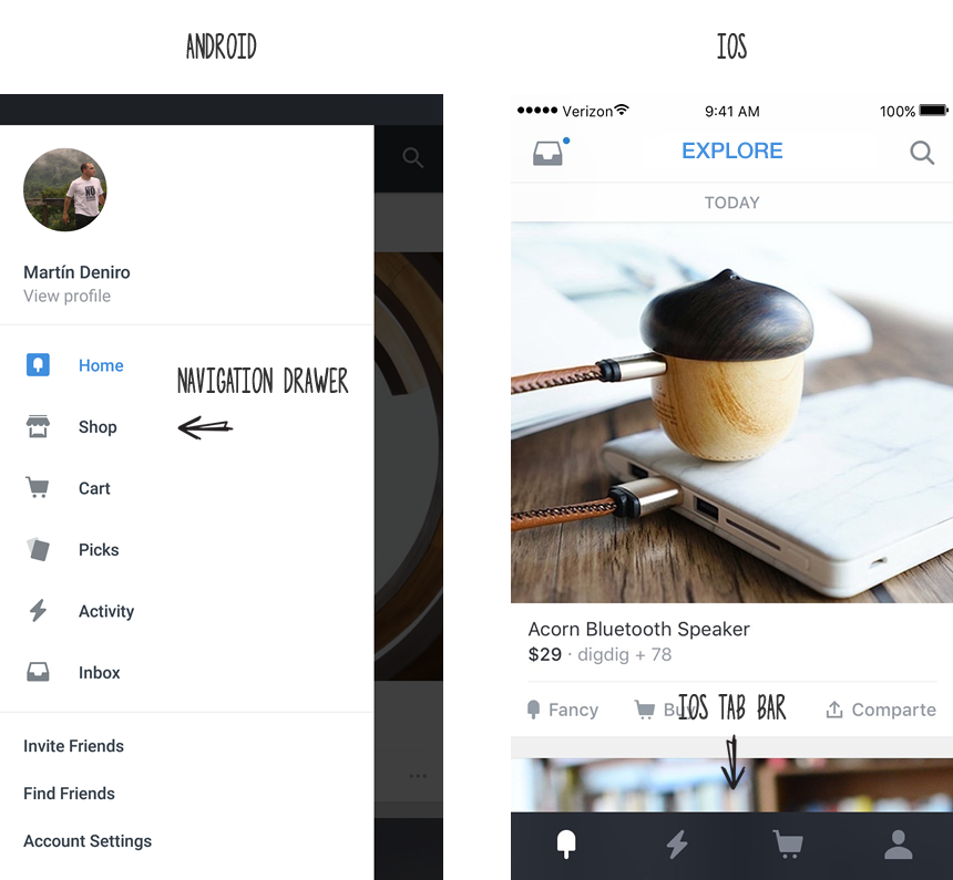
One way to ensure great usability is through the use of navigation UI patterns. There’s nothing quite like nav patterns because they allow the user to get right to the heart of your product, rather than waste time figuring out how to navigate through it. Of course creativity is wonderful, but only if you’ve adhered to some basic guidelines that dictate general navigation patterns. Users love simplicity, coherence, and consistency.
3. Actions
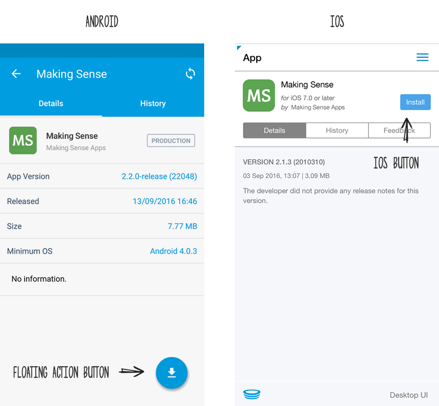
Users want easy access to the main app actions, and they expect to find this access in the action bar (Android) or Toolbar (iOS). As a general rule of thumb, main actions are the frequently used actions like share, search, and creating new content. A well-designed menu helps the user adapt quickly to your interface so they can get right into using (and hopefully loving) your app. A persistent menu also serves to de-clutter the user interface, thus highlighting the important functions the user really cares about.
4. Typographies & Hierarchies
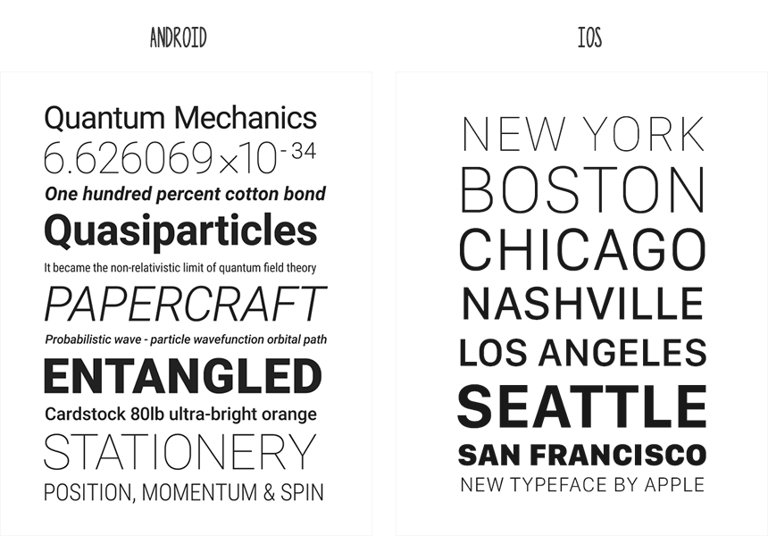
Roboto is the standard typeface on Android devices and San Francisco is the system font for iOS.
5. Icons
![]()
6. Gestures
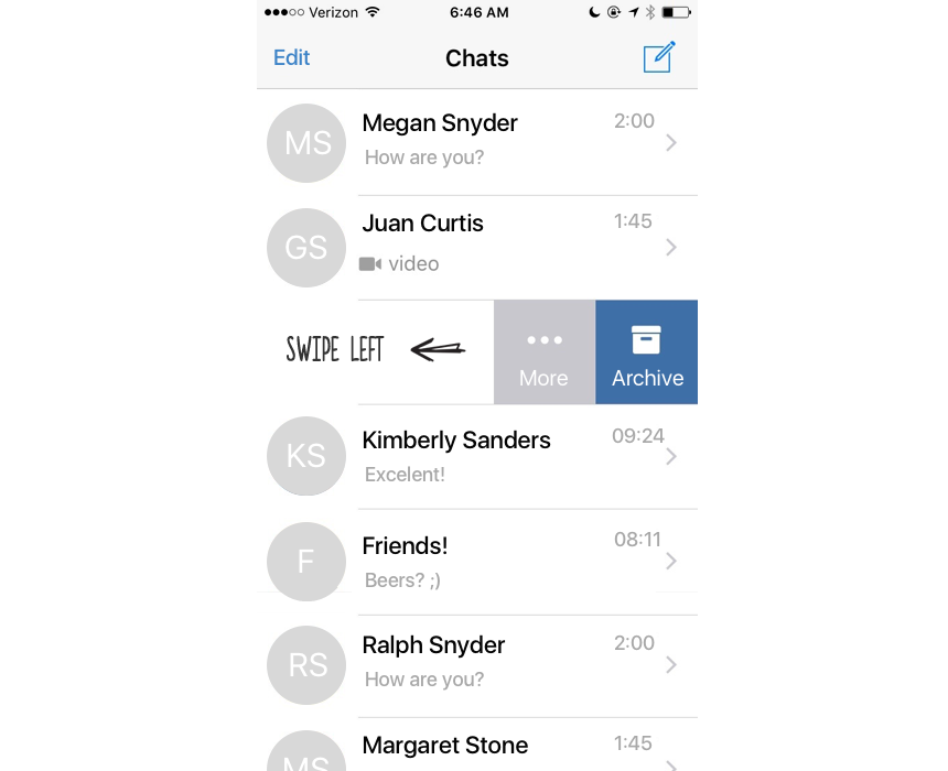
Almost a decade ago, when Apple released their iPhone in 2007, multi-touch technology went mainstream. Users everywhere were delighted to learn that they weren’t limited to just tapping on the new interface: they could also zoom, swipe, and pinch. Gesture control became a significant aspect of the user experience, and hence very popular with app designers since the help to solve problems like if the user wants to perform different types of actions, but there’s limited screen real estate to show all these controls.
7. Animation
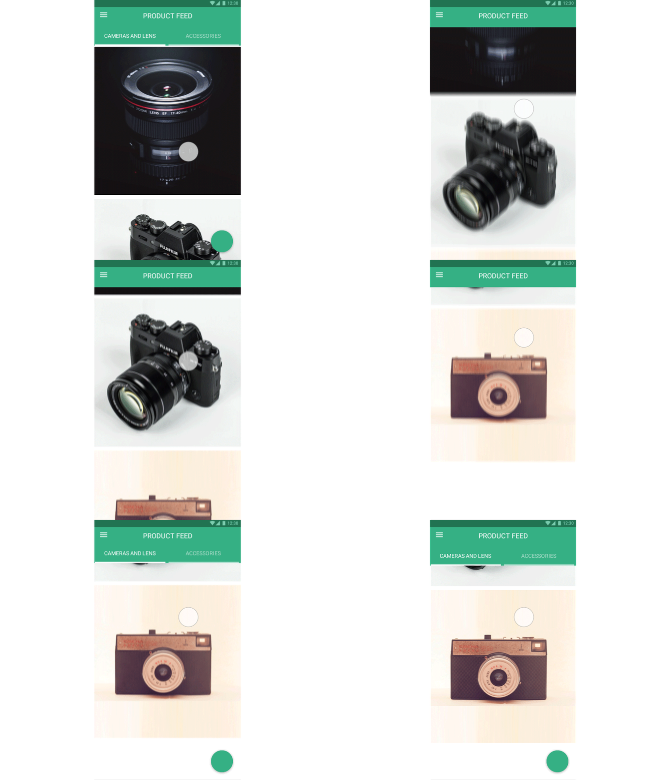
There’s really no end to the animations a developer can create, and when paired with gestures, animations provide an amusing, highly engaging interface for users. Animations also offer the user something incredibly useful: visual feedback on their actions within the app. This is only a brief intro to the wonderful impact animations have on the user experience.
Conclusion
There’s one last item you should know about, and that’s Device Agnostic Design. This is an approach to app development where device-specific recommendations are not actually followed. Instead, broad mobile standards are designed and developed, which are consistent across all platforms: Android, Web, and iOS.
There are a couple of reasons for this trend. First, organizations create apps for different devices, and they prefer consistency. Secondly, they can save on resources when they use the same design for every platform.
What are a developer’s objectives when choosing Device Agnostic Design? These designs still draw on user expectation across devices and they rely on design principles and take into account usability considerations. However, it can certainly be more time consuming (and expensive) to ignore mobile patterns and develop your own, but the result is often a better experience for the user.
Finally, although these concepts may not lead you to create a disruptive product, they do ensure a better approach to mobile app development. Whether you decide to follow mobile patterns or not… well that’s up to your business needs, of course!
