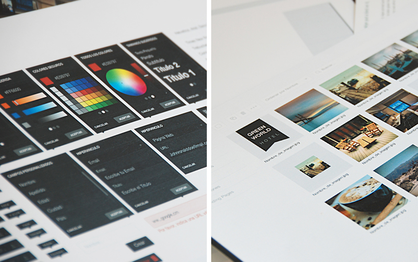
Making Sense recently made a number of changes to Doppler, our streamlined, yet effective email marketing tool. The strategy we applied to build the new doppler editor was to create a Minimum Viable Product (MVP) of the concept just to be able to progressively enhance it with users’ feedback.
We’ve added new features and functionalities in direct response to user pain points, helping to create a more valuable email marketing tool. Let’s take a look at what’s new in Doppler and why our Making Sense team decided to make these changes.
Past struggles pave the way
No solution is perfect on the first go around, and Doppler was no different. However, we were able to use these struggles to our advantage to establish an updated Doppler that addresses the problems users were having.
We found that previously, users were leveraging Doppler’s template editor, but not in the way that was intended. Through our Doppler metrics reports we realized users were simply uploading raw HTML data, and not employing our editor feature to its fullest potential. Also, thanks to the analysis of the support tickets regarding the editor we enlighted the editor’s usability problems.
In order to address this, our Making Sense team interviewed users to better understand how individuals were using the editor, and where problems crept up. We discovered that this feature was only being utilized just to alter templates, and that some found this capability a bit difficult to use. As a result, we set out to improve Doppler’s editor feature, and made a few other changes in the process.
A range of new, helpful features
Keeping our users’ input in mind, we set out to adjust our editor, as well as other Doppler elements, to create an overall improved solution. Our team took in consideration the user experience analysis techniques to improve the Doppler editor, using enhanced metrics, a competitive audit tool, heuristic evaluation, iterative prototyping and access to special use cases and scenarios.

Now, Doppler’s editor includes a revamped drag and drop feature, enabling users to add or change any previously combined elements to establish a truly unique creation, users just have to just pick an element from the toolbar and drag it to any place of the design. This approach also allows users to relocate sections of the email depending on their taste. In addition, we included a new preview of your design where you can see how the email campaign looks like both in mobile and desktop versions.

But we didn’t stop there. Doppler now has a more modernized and minimalistic look and feel, enabling users to maintain focus on the campaign they are creating. Doppler’s new user interface design includes a header with general information about the campaign, as well as a footer that allows users to navigate forward or backward through the campaign flow.
The UI design also has a new side menu with three sections. These include a component tool for selecting and dragging elements into the campaign design, a general settings tool for setting up general email styles and a canvas tool for creating, editing and designing the email.
Other new features include:
- Responsive emails for the best display possible, this type of emails are completely necessary nowadays. More than 50% of subscribers open their emails with their mobile devices. A non responsive email is a failure for the sender
- A new image gallery that allows for better image management through an updated drag and drop feature
- Email pre-visualization so users can view responsive and desktop versions of their campaign
- Inline component edition allows users adjust colors, sizes and alignments directly in the component
- Panel edition for managing settings associated with the general characteristics and behavior of each component included in the email
Updates in progress
We also have a few additional Doppler features that our team is currently working on, including:
- Updates to the image gallery to allow for image editing (color correction, crop, flip, rotate and resize)
- Editing buttons like save, undo and redo
- New components for social follow and share as well as video
- More Layouts, like 2, 3 columns layout and image gallery
- Functional updates including customized auto saving and the ability to send email drafts from the preview state to a user account
With all these upgrades, Doppler is now even more valuable solution for email marketing. For more information or to sign up for Doppler for free, click here.
