
The user experience involves all product design aspects, including how it looks, how it communicates with its branding, how it works and how it is aligned to the business objectives. Choosing the right technology is key, as it will determine if the product can perform and be functional.
Many companies think that having a beautiful interface will make them succeed in the market, but beauty is not a unique factor and doesn’t make your user interface useful and efficient. Your team must be conscious that design decisions consider users, context and devices.
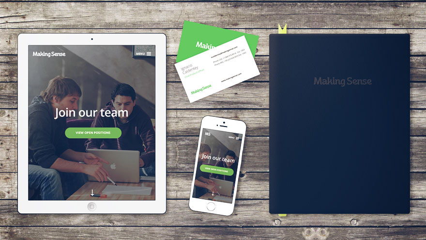
Designers should be consistent across the UI and with your brand guidelines.
“Consistency is one of the most powerful usability principles: When things always behave the same, users don’t have to worry about what will happen. Instead, they will know what will happen based on earlier experience.”.
Jacob Nielsen, NNGroup principal.
Asking these questions before starting can be helpful: What is this page for? What does the user need to know or do on the page? What is the main action taking place? This will not only produce a robust UI, but it will also help offer an enjoyable UX as well.
But what exactly makes the user experience so important? Let’s take a look and find out:
UX and UI are always linked
Many teams concern themselves more with the user interface the software will feature. However, some may not realize how closely linked the UI is to the overall UX. Users oftentimes base their first impressions of an entire application by the available menu options. If the UI isn’t clear, easy to navigate or simply doesn’t provide the features they’re looking for, chances are good that they won’t have an enjoyable experience using the software.
Designing the UI is no doubt important. But this stage of development should focus more on what the UI will include. Because the UI and UX are so closely linked, developers should ensure that they keep the actual users in mind as they are creating the UI. Taking a step back to ask, “Is this a product that I would like?” is critical, and it can sometimes be helpful to have someone not associated with the project take a look and share their impressions.
Usability Heuristics
When designing a product, teams should keep in mind Nielsen’s 10 general principals for interaction design, known as “heuristics.” Although these are broader guidelines and not necessarily specific usability rules, they are helpful to establish the UX the design team is aiming for. Let’s take a look at Nielsen’s 10 heuristics:
- System status visibility: This principal states that users should be continually informed as to the progress of the product through feedback that comes within a specific timeframe.
- Consistency between the product and outside world: Here, Nielsen recommends “speaking the user’s language” through familiar phrases and concepts instead of utilizing system-specific jargon. Designers should be sure to align the product with real-world conventions and ensure that content is presented in a natural, rational order.
- Control and freedom: In the event that users select a function by mistake, designers should be sure that there is a designated “emergency exit” for them to leave immediately. This prevents the user from having to read through extended dialogue or take extra steps to leave the function.
- Uniformity standards: Nielsen also advises adhering to platform conventions to prevent users from questioning if certain words or gestures have different meanings in specific situations.
- Error prevention: Designers should do their best to ensure that the product is free of errors.”Even better than good error messages is a careful design which prevents a problem from occurring in the first place,” Nielsen noted.
- Recognition as opposed to recall: Options, actions and objects should be clearly visible to users, and usage instructions should be easily accessible.
- Flexibility and efficiency: Nielsen recommends enabling users to customize frequently used actions so that expert users have the ability to accelerate their interaction with the product if they so choose.
- Minimalist design: Any irrelevant information should be eliminated from the dialogue as it cause confusion as it competes with important content.
- Assist in error recognition, diagnostics and recovery: Designers should avoid using any coding language in error messages and be sure these notifications express the problem and suggest a relevant solution in terms the user can understand.
- Help and documentation: When it is necessary to include help and documentation features, designers should be sure this information is easily searchable and includes a step-by-step list.
Overall, Nielsen’s 10 heuristics can help the design team ensure that they are creating a product that will offer a great experience for each user.