Some time ago, Cesar (our CEO) called me via Skype. Even though this is an everyday practice, I wasn’t sure what he would come up with this time. It is usual for us to talk about the company in general, the latest trends, or some specific project we are dealing with, but what was he up to?
His idea was to talk about our website, since we hadn’t updated it in a long time. Our first goal was to show our visitors everything that defines us, and at the same time, be elegant and provide the best user experience from any device.
Less talk, more action!
That very same day, I got together with other teammates from different areas of the company. This allowed us to seek the necessary information to work in an interdisciplinary way, as well as be aware of all the aspects that may have a negative impact on our project.
After I analyzed my coworkers’ feedback, I knew it was essential to reflect how we may be of help to our clients in a clear way. We should not list our abilities, but also design every section of our website with a straightforward message and aim to the correct audience. This way, we could improve the whole site’s general performance.
Overcoming obstacles
Even if it seemed to be just a “simple website”, I wanted to address this project very seriously and decided we needed the best team in order to meet our objective. It was difficult to be focused and to devote the necessary time to fulfill our ambitions because of the multiple active projects that the company was dealing with at the time.
We were able to overcome the obstacles in time and form a strong team composed of: Nancy Medica, as our Product Owner, Damián Muti, as UI leader, Martín Fantini as Scrum Master, and myself, in charge of the UX and design. So, with the team all assembled, we were ready to get to work.
What we did
As I said before, my awesome co-workers took part in this project and we would like to share with you the details.
Reflect our identity
Some time ago, we did our rebranding process, we changed our logo and developed a consistent image and inner culture. This iteration allowed us to adjust many pending issues and also show our daily work through in-house photos, without relying on stock material. And guess what? We found out that many actors and models were working among us!
A change in our tone of communication was also adopted. We wanted to sound less prim and start reflecting more the personal views and voices of everybody at Making Sense.
The UI Guide
Just as we do for our clients, I created a UI guide for this project. Whenever we start designing a page for our new site, we tend to ask ourselves the same questions: What is this page for? What does the user need to know or do on the page? What is the main action taking place? All these led us to elaborate a series of modules, being able to bring together correctly the interface in different contexts and devices.
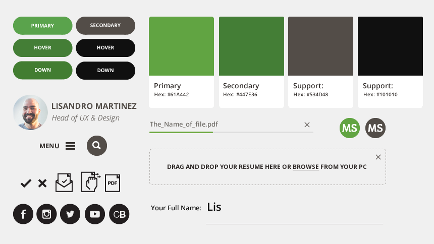
The Making Sense UI Framework
Damián and the UI team also developed our own, unique UI framework that adequately fitted the technical general needs of all the company projects. This allowed us to accelerate the website launch, while at the same time obtain a cleaner quality code so that in the future, any new feature may be easily added. I may well list some examples to illustrate what I have said, such as code minification and concatenation, image compression, icon font generation from an image folder, among others, but let’s leave it there, since Damián will be telling us much more about it in a future post and I don’t want to spoil it, so stay tuned ;)
Semantic HTML is not only a good standard, but is also good for SEO
Although there are lots of practices available for better positioning, we believe the use of semantic codes, rich snippets and a properly and hierarchically organized information architecture are useful tools for web crawlers. Thus, they can scan our information organically and we can achieve better results.
Delightful and usable Interactions
The UI team took up the challenge of reducing the use of JS and replacing it with HTML5 and CSS3. Although the task was tough, the results unveiled a faster and higher-performing website. Here is one of the most significant results: they implemented HTML anchors together with the CSS selector so as to use hashtags in the URLs to show all the contents hidden behind the interactions.
Brand new servers
Cesar is convinced that performance is instrumental for a good UX, so Damián got right down to work. In order to achieve it, we chose to get to the root of the problem and change our regular hosting system for a VPSs (Virtual Private Servers) cloud system and assign independent servers for both the website and the blog.
On the other hand, we left aside the classic set of LAMP tools (Linux, Apache, MySQL, PHP) and migrated to a system that offers a better solution to our needs using LEMP tools (Linux, Nginx, MySQL, PHP). After the first performance test, we noticed a 1.8-second improvement in the first content impression of the visiting browser and a noticeable service speed in mobile devices, reaching 50% of the average performance.
“In terms of performance, this website flies and amazes us, and that’s what I liked the most about the project”.
Damian Muti, UI Lead
Yes, we also re-built our video player
On several occasions, we talked to Damián about developing a custom in-house player and leave aside all those provided by different services.
Damián accepted the challenge and thanks to his team, we obtained a new player with faster interactions that allows us to provide a better UX, keep our videos hosted in Youtube and access them directly by URL (e.g. makingsense.com/video). This is, for sure, a great advantage when optimizing the site for search engines. HTML5 Rocks!
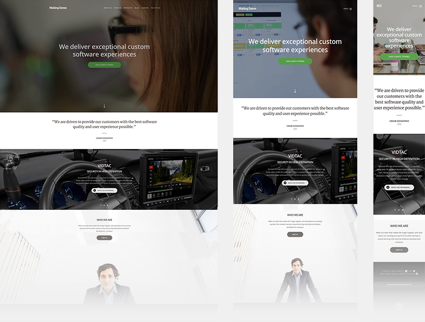
Responsiveness, with a tweak
Even though having sites that can be opened in different devices is not something new, we decided to take a step forward and change the current way in which the responsive websites usually work.
So, by accessing it through your laptop or desktop computer, you will be able to see a fluid website, until the minimum logic resolution of these devices is reached. Let’s face it and be honest…Who uses the desktop browser window in a mobile size in order to surf a website?
Besides, if you gain access through your mobile phone, you will be able to see the same desktop version but adjusted to the screen resolution from the device you are using.
In this way, we are offering the best experience according to the context needed.
We learned a lot but it’s only just the beginning
This week, Cesar visited our office in Mar del Plata, Argentina and, true to character, we had one of our typical talks. We concluded that, during the process, we formed a communicative and objective-focused team. It was very important for us to be in permanent contact with him, in order to show him our advances right on the spot and to detect changes on time so we could solve them before they became a problem. In other words, an Agile approach!
But most importantly, this motivates us to keep improving our work, so we are sure you will see some new updates on our site soon :)
Before I forget, our site is already online, check it out.