
For a while, we have been wondering why Apple, a state-of-the-art company that has always been at the technological forefront and that has long supported the cutting edge web technologies such as HTML5, didn’t count with a responsive website.
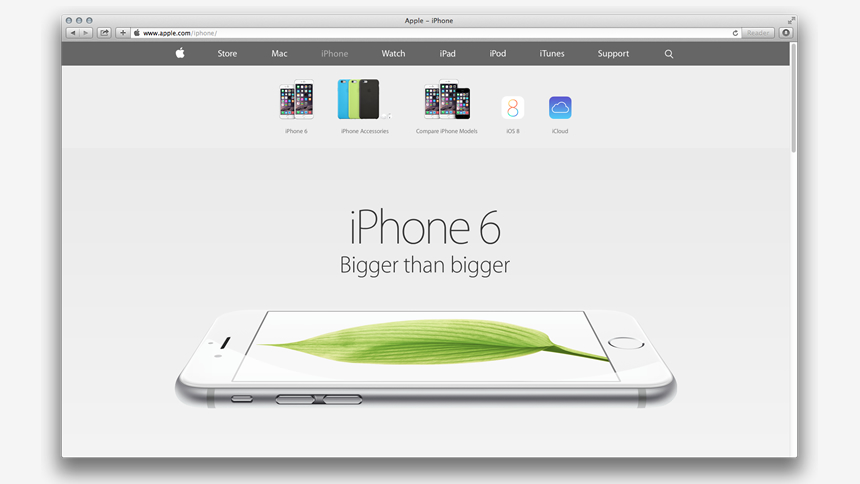
Finally, on September 9th, after the Apple Pay, WATCH and iPhone 6 presentation, a partial version of their responsive site was launched. But, why do we say that it’s only a partial responsive website? Because only the homepage and the new products’ pages are responsive, the rest still doesn’t count with this new technological benefit.
UX improvements
Based on my personal experience, I can tell that they have made a really smart decision since the webpages have the distinctive feature of adapting themselves and varying in size until reaching a width of 764 pixels and, from that point onwards, they remain fixed. What I want to highlight here is that they don’t continue adapting themselves and modifying their size as the rest of the responsive sites and most of the existing frameworks do. My first thought was that they have been working against the clock and that this was a healthy decision made on the spot in order to deliver a moderately acceptable site. But, when surfing it and studying it in depth I realize that this decision was a wise and sound one, so as to improve the user experience when surfing the site.
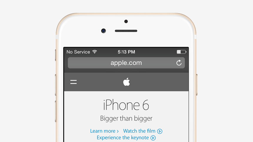
Think for a moment about the following: Do we really use the browser’s windows in such small sizes in a real context? I don’t think so. And I think that the fact that these pages were designed taking into consideration a real context of usage, saves many headaches and inconsistencies when opened in the different devices, browsers and operating systems. Another aspect that justifies this sensible decision is the fact that, when entering the page from a mobile device, the different sections clearly adapt themselves to the corresponding resolution. So, as I have stated before, the decision was clearly thought of and analyzed prior to the launching, but Apple has decided to show it and presented to the users only in the adequate context to do so. Moreover, if we take a look at the code, we’ll realize that, by rendering the adequate controls for the different contexts, it can indeed identify and it tells the difference if we are surfing the page with a mouse, or if we are using a touchscreen device.
Another decision that was polemic indeed throughout the social networks was the location of the hamburger icon on the right, instead of being on the left side of the page. At the beginning I thought that the decision was made taking into account the western way of reading (from left to right), but then I remembered that to have the menu located on the right side is one of the rules included in the Apple’s design guidelines for mobile interfaces. However, I would have preferred that when accessing the page through an Android telephone, the menu appeared on the left side (since it’s defined in this way in their guidelines). It would have been nice that they have actually given preference to the user and its context, instead of trying to impose a way of surfing.
Attention to details!
Even if updating and renewing a large site such as this one is a time-demanding task, I was really surprised that, considering that Apple is a company that pays a lot of attention to small details, on this occasion many small but important details, such as the one I mentioned before, haven’t been improved, and many others haven’t even been well executed.
The first aspect that called my attention was that they’ll make use of a hamburger icon of only two lines, since this icon has appeared many years ago in the Xerox Star operating system, which has been Steve Job’s source of inspiration for the first interfaces of Apple’s operating systems. It is also worth mentioning that in IOS a different icon is used and, in the IOS website a similar icon is used but for a secondary menu.
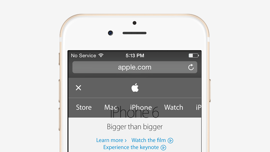
Another aspect that has been surprising was the strange idea of offering a horizontal menu that doesn’t show all the main options available and that, besides, it is not well executed and makes surfing the website a really tough experience. Despite all the negative aspects that this might have, I tried to think of the reason for such a decision and I thought that it was designed this way not to cover the webpage’s content with the menu. But, even if that has been the reason it will still be a mistake and a bad decision, since it would have been much more logical to clearly offer the menu’s options and, in that way, the user wouldn’t be paying attention to the page’s content. Apart from that, the mobile users are used to have surfing menus in the middle of their displays and that shows them clearly the available options they can choose from.
One of the weakest aspects I could detect is the use of images for non-standard sources. This has long ago stopped being a problematic issue, since they have themselves designed a source for WATCH interface. Therefore, they could as well have designed and implemented a web font for their own website and thus save some troubles when using images, something they use a lot, by the way.
Finally, a small detail that is worth mentioning is the fact that in the new Apple’s responsive webpages the interface could have been better presented, rather than in three columns. Even if the columns are correctly appreciated when making use of low resolution devices, when the site is seen in a big resolution display, the image is not as “smooth” as expected. The fact that they haven’t thought of this aspect is even more curious, as they sell 27 inches displays and it would have been a good idea to verify how images are shown, at least, in their own devices.
In any case, I hope that as time goes by the website continues to be updated and that mistakes are conscientiously corrected so that the new Apple’s responsive website can be appreciated and enjoyed as expected.
In a fast changing world, where innovation is evolution we must adapt beforehand to these technologies and techniques. The concept of Responsive Design must be embraced within these current changes where the aim is to provide an excellent UX. At Making Sense we are not only interested in Responsive Design, we actively pursue offering it to our clients in the most innovative way possible.
So, if you are willing to partner with us, and have an idea that you want to turn into real software, contact us!